THE JOURNAL
The Writing On Your Wrist: Why Your Watch Is Telling You Much More Than Just The Time
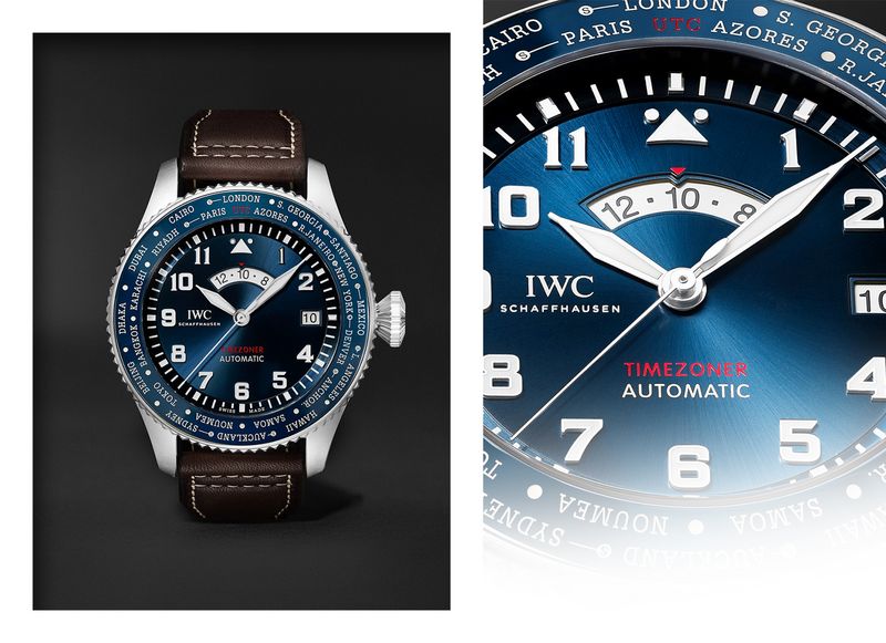
“It’s the one aspect of watch design that I think people tend to perceive unconsciously,” says Mr Christian Knoop, the creative director of IWC Schaffhausen. “They like what they see, but they’re not quite able to explain why. But that’s the importance of typography. I’m surprised this isn’t a topic [in watch design] more often discussed because, more than many 3D objects, it’s the face of a watch that in large part determines its personality.”
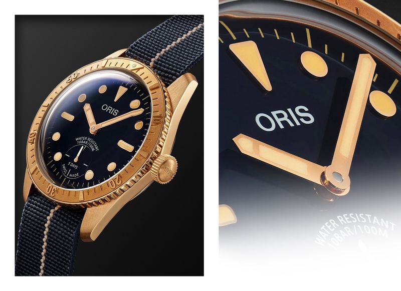
Indeed, while a record cover, T-shirt graphic, advertising spread or transport poster can become an award-winning icon of the typographic arts – even a pop cultural artefact – spare a thought for the tiny letters, numerals and indices that grace the much smaller, more challenging canvas of the watch dial, but which, in their own way, can have just as much impact. “Getting them right really matters,” says Oris’ CEO Mr Rolf Studer. “And then even just one index, seen glowing with its lume, can be enough to identify a specific watch.”
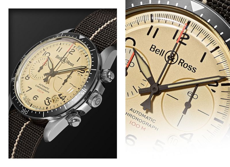
The complexity of typography can escape you if you’ve never stopped to consider it. But the choices to be made are huge: not just the typeface itself but the size, colour, contrast, weight, spacing, position and form of the text and numerals on a watch all play a part. It signals not just a brand’s arrival – the “typographic signature, be that timelessness, or modernity,” as Bell & Ross’ co-founder Mr Bruno Belamich calls it – but also the individual watch’s intent. More classical dress watches inevitably look back to classical type (literally, in the case of Roman numerals) or work with echoes of calligraphy, whereas tool watches tend to utilise a graphically more direct sans serif. Typography can evoke a period feel – some heritage models or re-issued designs appeal precisely because their typography seems to belong to a past era – and, in doing so, sometimes that can be a watch’s “killer app” feature, as with the likes of Oris’ first-edition Sixty-Five Diver. Or, in its reduction, typography can suggest a watch exists very much in the now.
“More than many 3D objects, it’s the face of a watch that in large part determines its personality”
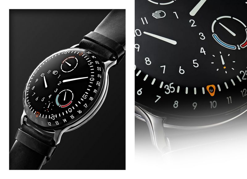
Typography can even be an expression of production methods. Tampography – also known as pad printing – allows for just about anything to be printed onto a dial, while numerals or indices can be given a 3D form, either in metal, or more recently, in being carved from tiny, solid blocks of luminescent material. In the instance of a Ressence watch, the numerals’ rounded outline is necessary to allow their milling directly into the dial, which is then filled with luminescent material. “That’s very pragmatic but it also gives you a key element of the Ressence identity,” explains founder Mr Benoît Mintiens, “being in keeping with the pebble-like roundness of the watches as a whole.”
There is, of course, a function to dial typography that underlies the information it may convey. For many brands, such as Ressence, it’s about legibility, which is why, Knoop explains, IWC continues to use the clean-cut Gotham and Helvetica New fonts, despite their becoming somewhat ubiquitous. “You have to ask whether you’re choosing a typeface because it’s trendy or for reasons of design and engineering,” he suggests.
If that sounds like watchmakers are trying to master too many competencies, Mr Mason Wells, co-director of the Bibliothèque design agency, argues that their sometimes “untutored” approach is precisely what enhances the distinctiveness of the resulting watch. “You see things on dials that as a graphic designer you wouldn’t usually do yourself,” explains Wells. “Maybe the numerals are slightly too expanded or two very similar styles are used in close proximity. And, of course, production methods have a bearing, too. The human interactions of making a dial, especially in older watches – inconsistencies in line weight, for example – also make for the kind of, technically speaking, idiosyncratic aspects that are one of the reasons we love watches.”
Yet watch brands seem to be upping the ante in the attention paid to their dial typography. As Studer notes, “with watches getting more expensive, watchmakers are having to give each detail [of typography] ever more consideration, or [conversely] are using that attention to detail in order to create a more upmarket product.”
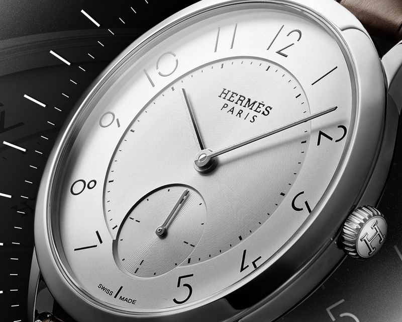
That’s one reason why, with its 2005-2018 Ingenieur collection, IWC decided to design its own in-house typeface. Other brands are looking for fresh eyes outside of the company – Hermès Timepieces’ Slim d’Hermès is arguably so distinctive thanks to the custom “broken” font devised by Mr Philippe Apeloig, a graphic designer who’d never worked on a watch dial before. “Fonts do not aim to stand out,” says Hermès’ horological creative director Mr Philippe Delhotal, of the brand’s objective, “[so much as] blend in with the overall design of the timepiece. That’s why they feature stylistic and geometric elements derived from the case or story around the design. In the Hermès H08, for example, the ‘0’ echoes the shape of the bezel, while the ‘8’ has the same contours. On the Arceau model, the numerals are sloping toward the centre of the dial, like a horse galloping in a horse-riding school.”
Other makers have undergone a shift in emphasis with regards to all that tiny lettering. Oris is a case in point. Seven or so years ago it used off-the-shelf fonts and, like so many watch companies, wasn’t shy in littering its dials with verbiage. “But it was part of the development of the brand that, although there are thousands of fonts out there, we realised none could quite say what we wanted it to,” says Studer. So it too began to work with a typographer and began to cut back on its dial text.
“We don’t feel it’s necessary to state, say, ‘automatic’ anymore, because we feel that by now people know we make automatic watches,” he says. “Stating the level of water resistance, certification and so on just isn’t necessary information a lot of the time.”
That’s because watch typography isn’t just a question of which font, but how that font is then deployed. “That can mean very small differences, but ones that have a big influence on the perception of the design and of your brand values,” argues Mintiens. “Above all, the typography and how it’s used has to be coherent from a design perspective, and not just another form of marketing.”
“The human interactions of making a dial, especially in older watches – inconsistencies in line weight, for example – also make for the kind of, technically speaking, idiosyncratic aspects that are one of the reasons we love watches”
Most watches use text to speak at least the country of origin and brand the latter, according to Belamich, still essential to the status value of an upscale watch for most customers, though some watchmakers, such as H. Moser & Cie, have been so bold as to design a watch entirely devoid of typography. But it’s become a trope of sports watch design, for example, to pack on technical information that’s strictly surplus to the user’s needs – information, it seems, underscores machismo. Just check out the Casio G-Shock GMW-B5000TVA-1 Titanium Virtual Armor to see where that ends up. In contrast, it surely says something that high complications - with lots that could be explained - rarely come with dials offering lots to read.
As Knoop points out, even when it’s there sometimes it doesn’t much matter what the text says. And that’s the art of typography: “Sure, I think some watches have too much text,” he says, “but that kind of information is typically applied not just as the space allows, but often because it’s necessary to balance the dial out visually. Sometimes it’s not that you need the content it gives, you just need the shape.”