THE JOURNAL

Shenzhen Airport, China. Photograph courtesy of Archivio Fuksas
MR PORTER takes to the skies for a tour of the globe’s best terminals.
Architecture is largely invisible to us as we rush around, just a great big background for bigger concerns. Travel inverts that. Our senses are sharpened. We look up. Add in the otherworldliness of a journey through the clouds, plus the excitement and fear that travelling provoke, and you have a heady combination. If you think of the airport as a system – a well-oiled machine for managing flocks of us and for turning flying into a calm, everyday experience by using millions of computerised processes and hundreds of employees – these buildings immediately become more important than the sum of their parts. They are the cathedrals of the jet age. Get them wrong, and the experience can colour the whole trip. Get them right, and the soul can soar just as jets do. Here are our seven favourites from around the world.

Photograph by Burg + Schuh/palladium.de
Mr Johann Wolfgang von Goethe said “architecture is frozen music”, but Mr Santiago Calatrava’s architecture is more primal. This is architecture as frozen time. His buildings evoke fossils, skeletons, pre-history. Everything is still. Which is strange because this is a man who designs places where nothing stands still – namely train stations and airports. The fundamental motif of the airport is movement. The terminal at Bilbao is a fascinating counterpoint to the flows of people, the queues of Iberia jets, the baggage belts, the towing vehicles, the birds that fly in from the Bay of Biscay and have to be scared away. It just stands and takes it all in, oblivious to the quietly managed chaos happening under its broad-undulation roof. It dates from 2000, when the northern Spanish city was on an all-out quest to be rediscovered by the world, a time when it commissioned the Guggenheim and a new Metro system, along with this airport, to relaunch its international brand. Like all Mr Calatrava’s buildings, the style overwhelms and practicality isn’t top of the pile (arriving passengers are spat out into the open air where you imagine there should be an arrivals hall with a roof). Yet you won’t forget an hour here waiting for a flight, rubbing your fingers against the smooth concrete and contemplating the acute angles of the walls.
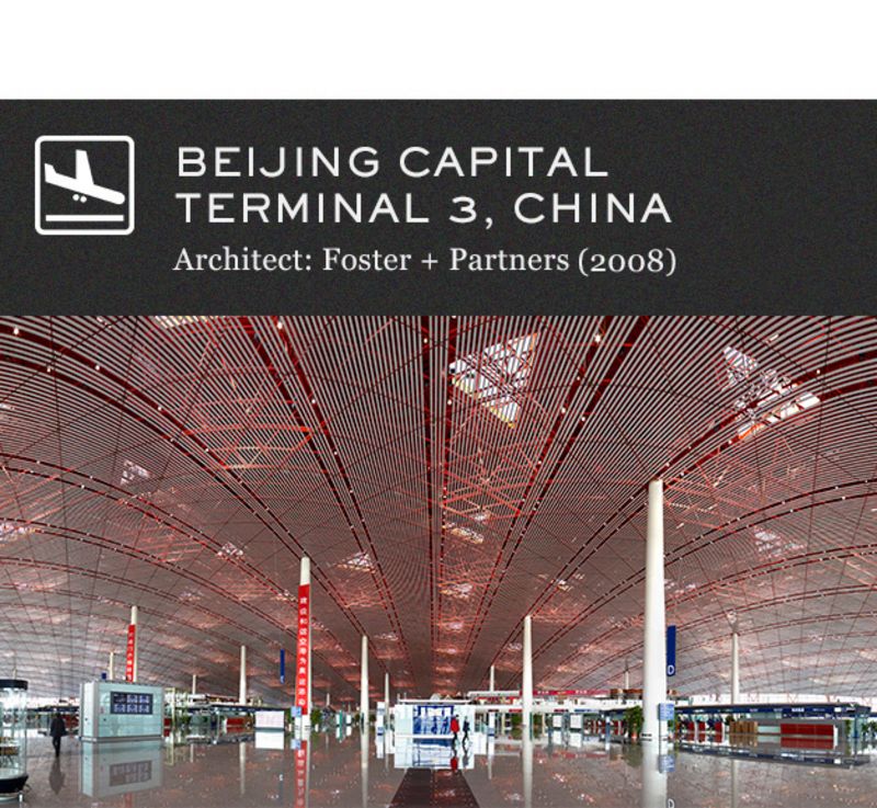
Photograph courtesy of Mr Nigel Young/Foster + Partners
European cities led the way in airport design in the middle of the 20th century and American airports were at the cutting edge at the end of it. But the 21st century is Asia’s time. Mega airports have been built all over the continent, including Singapore Changi, Kuala Lumpur International, Hong Kong’s huge Chek Lap Kok and Kansai Airport, which is built on a man-made island off the coast of Osaka. All of them have pushed at the limits of architecture and engineering. In terms of sheer size and swagger, Terminal 3 at Beijing Capital is without peer. With almost 1,000,000sq m of floor space, it’s one of the world’s biggest buildings and the world’s second biggest airport terminal after Dubai. Its intriguing dragon-skin ceiling, sinuous curves and ruby colouring give it a distinctly Chinese look, while the building is filled with Chinese art. No surprise – the country wanted to show off its best side as the airport was a central part of the Beijing 2008 Olympics. Its scale dominates, but there’s also a kind of clean minimalism to it, as you’d expect from Lord Norman Foster and his team, who were responsible for the ground-breaking design of Stansted Airport in the 1980s. Here, the team – aided by engineers Arup – used thousands of small skylights to provide light. By angling them to the southeast, they collect thermal energy to heat the building while their small size prevents it overheating in summer. Amid the chaos of people and processes that are continually growing as China’s domestic and international aviation industry booms, this airport stands as a huge temple to global travel.
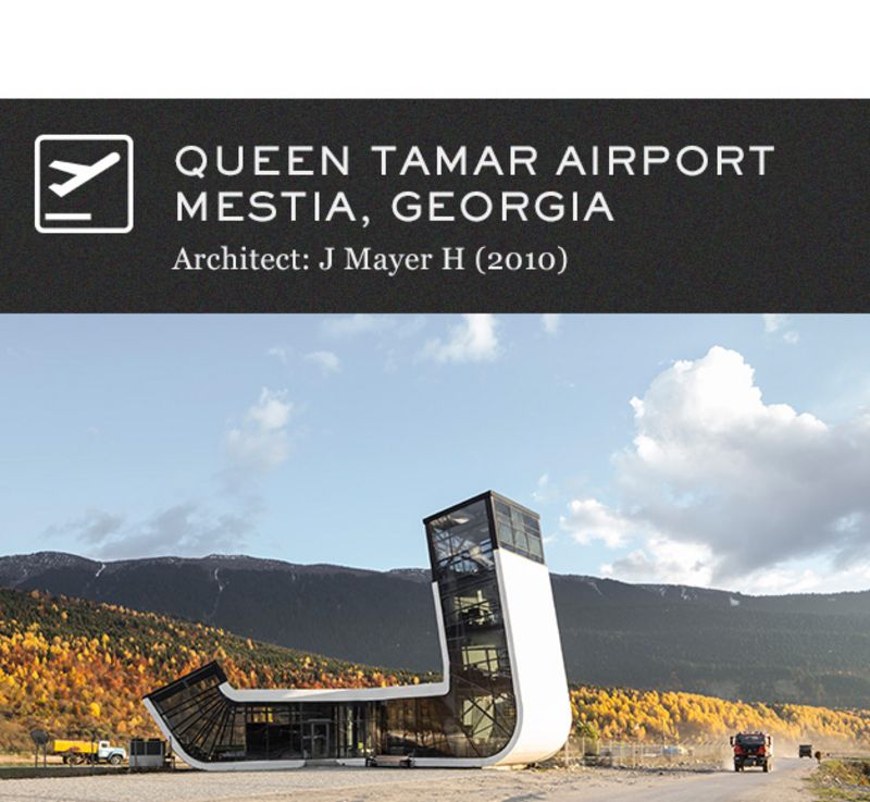
Photograph by Mr Marcus Buck/courtesy of J Mayer H
Architecture has always been about branding. The Greeks and Romans were trying to say something to the world just as surely as Mr Donald Trump was with his priapic adventures in real estate of the 1980s. A newly independent Georgia wanted to assert its independence from Russia. The man to do this was Mr Jürgen Mayer, a Stuttgart architect with an uncommon sense of imaginative possibilities (see also his lauded wooden sun parasol that spans the Plaza de la Encarnacíon in Seville, Spain). He gave Georgia a wonderfully wobbly border control point with Turkey, along with a series of neo-brutalist motorway service stations. But his real coup de grace was this tiny airport, which serves the small Unesco World Heritage town of Mestia. The smoked-glass building looks like the stylised J that the firm J Mayer H uses in its branding. Inside, the place is minimally decorated in plain whites and free from clutter. The summit of the structure has a control tower, too – there’s everything you need in one place. Except for flights. There aren’t too many of those even now. But maybe when Georgia’s embryonic tourism industry picks up...
Photograph by Arco Images GmbH/Alamy
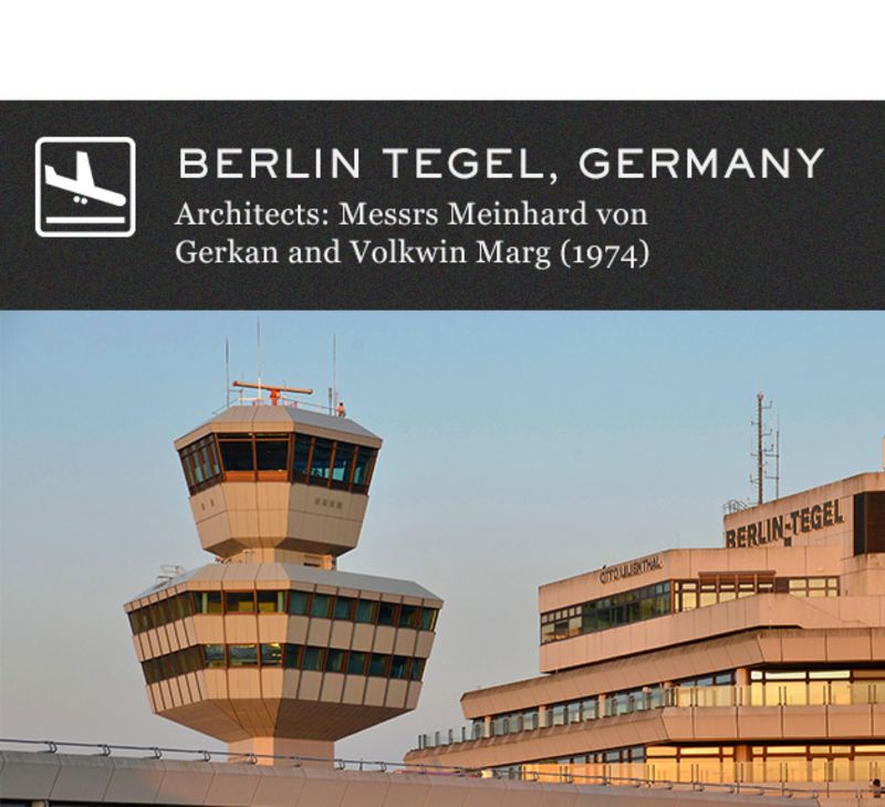
Seven is the righteous number and six is the devilish one. It’s apt that everything at Berlin Tegel is hexagonal then, because Berlin is the decadent, dissenting, do-as-you-please capital of Europe, the place of mid-career Mr David Bowie, of Mr Nick Cave and Mr Wim Wenders. Built when Berlin was encased in a Soviet wall, it is the only airport on Earth with a design where everything is six-sided, from the terminal building to the roads, floor tiles and even the original seating blocks. Truly, Messrs Meinhard von Gerkan and Volkwin Marg were obsessed. Their arresting brutalist concrete finishes give the place an ugly duckling air and yet it is cool and efficient. The distance from car to gate is miniscule – just a few steps. Inside, you feel sealed off from the cold behind thick glazing and, true to form, the approaches to the gates aren’t anything like the shopping malls that other airports have become. There’s hardly any retail to speak of, except around the check-in desks. It is mesmerising, and comes complete with one of the city’s best currywurst stands out the front. Which sums up its eccentricity, the result of an age when West Berlin was experimenting with other weird wonders of modernism, such as the Bierpinsel and St Agnes Kirche. Tegel, perhaps unsurprisingly, has a huge fan club. A petition to prevent its closure when Berlin Brandenburg airport finally opens has been signed by thousands of Berliners.
Photograph by Mr Balthazar Korab/OTTO
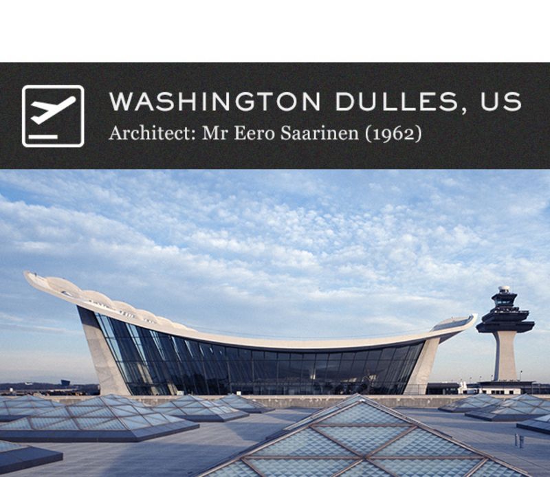
The US had been about the muscle and the mechanical before the 1960s ushered in an era of free-wheeling cultural change, and you can see that in its buildings, not least in Mr Eero Saarinen’s two airport terminals – the TWA Flight Center in New York and Dulles in Washington DC. Both of them sing the praises of flight and exhort Americans to look beyond themselves. They are completely cosmopolitan structures. The TWA Flight Center at JFK is surprisingly compact, yet utterly spellbinding in its avian shape. At Dulles, the whole enterprise has been super-sized. The huge main terminal building is full of space and light and a roof that flicks up like a quiff. The expansive check-in area still feels right out of this 1960s dream. The roof space is enormous where the building rises, giving a light, airy and confident feel and the use of concrete is very much of its time. Finnish architect Mr Saarinen brought Scandinavian simplicity to American airports that, even now, you can imagine Don Draper striding through on his way to LA. Mr Saarinen, who also built the emblematic Gateway Arch in St Louis, mixed elegance with high technology, and at Dulles pioneered the Plane Mate (or Mobile Lounge) concept, huge moon buggies that still ferry passengers from gate to plane. You wonder why these monstrous vehicles aren’t in operation at more airports today. Aside from at Montreal Airport, they’ve largely been phased out, which is a shame.
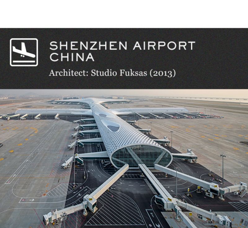
Photograph courtesy of Archivio Fuksas
Whether or not Mr Massimiliano Fuksas and his Roman team designed this airport to be wholly Instagram-ready is a moot point. The reality is that the finished plane-shaped building does indeed photograph like a fashion model. As do so many other Studio Fuksas designs, such as the Zenith Music Hall in Strasbourg and the Fiera Milano complex in Milan. Its white colour scheme is pleasingly flash. The high-tech “skin” by German engineering firm Knippers Helbig that envelops the whole thing adds a textural experience on top of everything going on below. It’s not as big as Beijing’s, but bigger than many Chinese airports and indeed its size makes it airy and uncluttered, not always things you associate with Chinese design. It’s certainly a building that has put Shenzhen – used to living in the shadow of its neighbours Hong Kong and Guangzhou – on the map. And like the similarly ambitious and also slightly serpentine Harbin Opera House, it shows that China is serious about architecture.
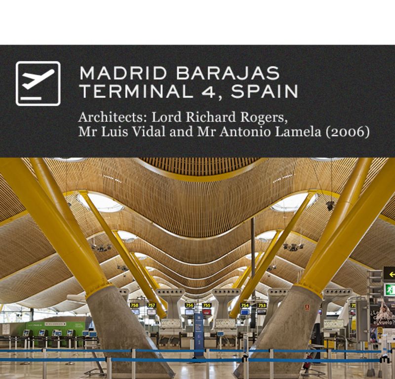
Photograph by View Pictures/REX Shutterstock
The best thing about Madrid Barajas is the air ducts. No one does air ducts like Lord Richard Rogers – just look at his functionalist design for the Pompidou Centre in Paris and Westminster Underground station. These ones look like some kind of vast hairdryers from the salon of a 1970s giant, and they add a playful touch to Madrid Barajas Terminal 4. Lord Rogers also deploys colour here expertly, a pop aesthetic that began when he worked on the Pompidou. The colours flow like a spectrum, guiding you to the right part of the two enormously long terminal buildings, which are separated by Tarmac and connected by an underground monorail. The flow from blue to green to yellow is hugely pleasing on the eye from afar, and up close, the colour variations are silky and subtle. The generous use of bent wood makes this super-modern building feel a little more homely, and the Madrid light – you’re high up on a plateau here – floods into every corner. The terminals are elongated, like two chorizos laid next to each other, and separated by taxiways. There’s no outside space like Barcelona’s courtyards, but Iberia’s business-class lounges “hang” on a kind of mezzanine level and are packed with plants, which gives the feeling of being on a balcony overlooking the melée below.
Concrete Concept (Frances Lincoln) by Mr Christopher Beanland is out now