THE JOURNAL

All photographs courtesy of Taschen
A new book, Art Record Covers celebrates the best collaborations between musicians and artists since 1955.
What’s the first thing that comes to mind when you think of The Beatles’ Sgt. Pepper’s Lonely Hearts Club Band? Despite the album being the most influential rock ’n’ roll records ever made, we doubt your initial thoughts are of the groundbreaking sounds of “Within You Without You”. Instead, it is more likely to be of the artwork, created by Ms Jann Haworth and Mr Peter Blake – two names that are lost to the astonishing visual melée of celebrities and historical figures that adorn the sleeve. This is an idea that strikes at the heart of Mr Francesco Spampinato’s new book Art Record Covers – published by Taschen, and available to buy tomorrow.
By analysing 500 covers made since 1955 (in a thorough manner which reflects his position as professor of performance art at Rhode Island School of Design), Mr Spampinato celebrates the “appealing phenomenon” of art and music combining to create culturally important album sleeves. From modernism to pop art, and conceptual art to postmodernism, the book compiles the most important works of album design in a tome that provides a history lesson in art and music simultaneously. Notable mentions include Mr Andy Warhol’s Velvet Underground & Nico cover in the 1960s, Mr Jean-Michel Basquiat’s involvement in the New York punk scene in the 1980s, Mr Chris Cunningham’s work with Bjork in the 1990s, and the more modern input of the YBAs. If nothing else, given the fact that vinyl sales now outstrip that of digital, Art Record Covers is a timely reminder that to have a pile of records is to own an art collection. Below, we pick out three of our favourite record sleeves mentioned in Mr Spampinato’s book, which you can purchase here.

THE VELVET UNDERGROUND & NICO
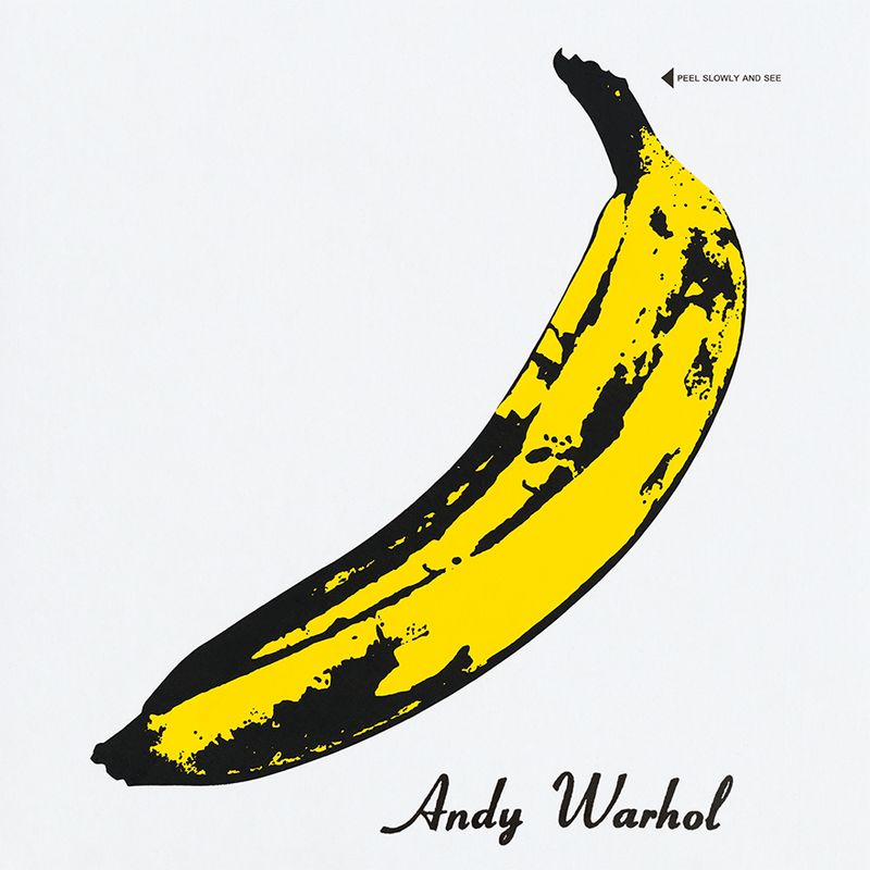
Artwork by Mr Andy Warhol, 1967
Such was Mr Andy Warhol’s influence over music during his years as an artist in the 1960s, his name features in Art Record Covers more than any other. And this, his most famous work with a musician (he also collaborated with Mr John Lennon and The Rolling Stones) is surely the most iconic example of music and art combining to create something better than the sum of its parts. Mr Warhol honed his skills as an artist at Columbia Records, and created his first ever cover in 1949 for an LP called A Program Of Mexican Music. Having pioneered pop art, inspired by the famous people he met at Studio 54, he used this style for the artwork of Velvet Underground and Nico’s self-titled debut in 1967 – an interactive piece which is more than a little suggestive (“Peel slowly and see” – the yellow skin revealing a pink banana beneath). The album itself was influenced by the hedonistic activities at Mr Warhol’s Factory studio, which saw countless musicians and artists tread its floors during the 1960s. This album inspired Mr Brian Eno to say, “it only sold 10,000 copies, but everyone who bought it formed a band” – something helped, no doubt, by Mr Warhol’s striking art.
NERVOUS BREAKDOWN – BLACK FLAG
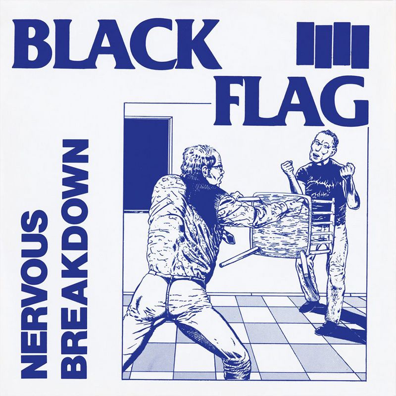
Artwork by Mr Raymond Pettibon, 1979
Mr Raymond Pettibon’s comic-like critiques of post-war American culture lend themselves perfectly to a punk aesthetic. In the 1970s, Mr Pettibon published his work via zines and gained notoriety via the southern Californian punk scene – but now you are more likely to see his work hanging in an art gallery. Whether you are familiar with Mr Pettibon or not, you will recognise his work in the form of the four bar symbol of the hardcore band Black Flag, which shows how influential a figure Mr Pettibon was in the rise of the West Coast punk scene. He has designed a huge range of album sleeves and is undoutedly an icon of punk rock, but he would be far too modest to admit that. “I was just one of the first motherfuckers out there in the beginning when there was just a handful of punk rockers,” he said at the time. In Mr Spampinato’s words, “The image depicts a belligerent pupil cornered by a threatened teacher gripping a chair – a visual metaphor of punk itself and its impellent urge for social rebellion.”
GRADUATION – MR KANYE WEST
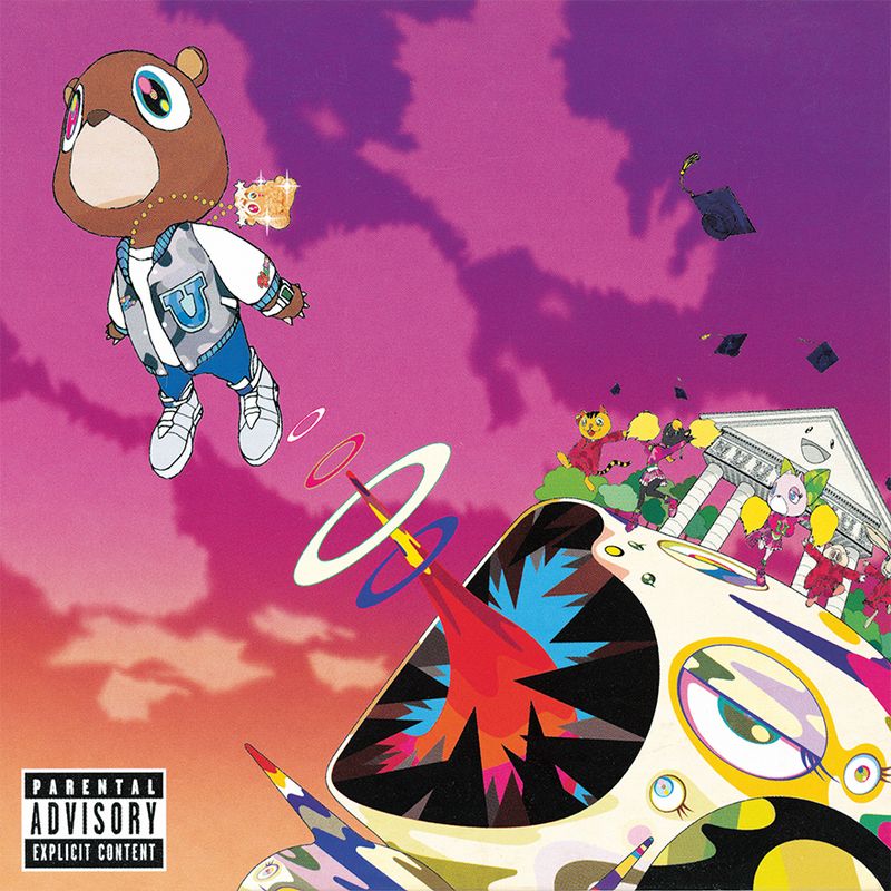
Artwork by Mr Takashi Murakami, 2007
Mr Kanye West’s third album – and possibly his most consistent and rewarding – championed experimental hip-hop, signalling a departure from the genre’s gangster rap sound (see: 50 Cent). It seems apt, therefore, that, alongside guest appearances by the likes of Mos Def, T-Pain and Mr Chris Martin, Mr West chose “Warhol Of Japan” Mr Takashi Murakami to create his album artwork. He said at the time that, “Kanye’s music scrapes sentimentality and aggressiveness together like sandpaper, and he uses his grooves to unleash this tornado that spins with the zeitgeist of the times.” Fitting language, it would seem, for Mr Murakami’s post-modern anime-meets-manga work, which he also lent to a video for the track “Good Morning”. “Following a visit to Murakami’s studio in Japan in 2006, West supervised the visual process by feeding Murakami with a constant stream of new ideas,” says Mr Francesco Spampinato in Art Record Covers – this sparked the creative collaboration. Mr West’s reward for this artistic dabbling? An honorary doctorate from the School of the Art Institute of Chicago in 2015.
GREATEST HITS
Keep up to date with The Daily by signing up to our weekly email roundup. Click here to update your email preferences