THE JOURNAL

After Burner, 1987. Image by Sega, courtesy of Thames & Hudson
START. INSERT COINS. HIGH SCORE. GAME OVER. To even the most rudimentary gamers, these simple locutions will no doubt have graced a screen in front of you at some point. The design behind the bitmap typefaces, however, is less likely to have crossed your mind.
When arcade gaming was in its infancy in the early 1970s (and through its development in the 1980s and 1990s), video game designers were limited in the colours and resolutions they could use, not just in the games themselves, but in the words and numbers that tied everything together on screen. Still, the limits in place at the time stimulated a potent and playful wave of unbridled, global creativity that stretched from Japan to the US, and produced some of the most fascinating and vivid typography of the 20th century. This little-explored world is the subject of a new book, Arcade Game Typography, by the UK-based typeface designer Mr Toshi Omagari.
Arcade Game Typography is the first book of its kind, and sits in the deliciously nerdy intersection of videogaming and graphic design. As such, it gives an all-encompassing and incredibly well-researched insight into an undocumented movement characterised by “outsider typographers”. From Pac-Man to Marble Madness via Shinobi, the book presents a finely curated selection of nostalgic fonts and their surrounding histories, exploring the (surprisingly accessible) otaku-level minutiae of gaming typeface design.
We caught up with Mr Omagari to talk about his favourite retro games, how he went about researching the book and how the arcades of yesteryear have helped to shape the gaming landscape today.
___
_How did you first get interested in arcade game typography? _
It was a crossroad of two of my favourite topics. I grew up with video games starting with Nintendo Famicom and chose a career in typeface design. It was only in the last few years I started noticing that retro games had their own collection of typefaces. Then I realised that the subject was virtually unexplored, which gave me the urge to be the first.
___

Power Instinct Legends, 1995. Image by Atlus/Cave, courtesy of Thames & Hudson
___
_What are the general qualities that define early arcade typefaces? _
The 1970s designs were simple, but well-executed, because of the limited technology and American dominance of the market. There were a few good ones that were copied everywhere, so the variety was rather weak. Since Japan took over the industry, the fonts over there were definitely more experimental, being that they were designed by non-native users of the Latin alphabet. Over the years, legibility as well as decorative quality improved a lot. As they gained more bits, they had more luxury to spend more colours to fonts. In the 32-bit era, you would sometimes see typefaces using 20 colours!
___
_You write that the designers of these typefaces were rarely credited; does that mean that we don’t actually know who created most of these? _
Exactly. We take a lot of things for granted in arcade games such as high scores, credits and the concept of beating the game – early games ran the same content in infinite loops. Even when we started to see credits, typeface creation probably wasn’t considered important enough to have its own credit and we can only assume that the graphic artist did the job. Also, in the early days, Japanese gaming companies often credited fake names to prevent competitors from headhunting their employees. If there is only one graphic artist credited (and with their real name), then that person was probably responsible for the typefaces in the game.
___
_What makes now a good time to revisit this subject? _
Of course, these pixel fonts have been with us the whole time, but I think the key factor is the font technology. Colour fonts in computers are just about 10 years old, but it only became possible to make and use colour fonts for publishing two years ago. Besides that, there are not many people who grew up with video games, have years of experience with typeface design and are crazy enough to give up all of their free time on this. And all without a partner (I found one and got engaged afterwards, so don’t worry).
___
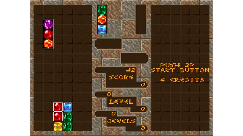
Columns, 1990. Image by Sega, courtesy of Thames & Hudson
___
_You say you reviewed more than 4,500 games in the course of researching the book – what was your favourite and why? _
My favourites are also my old ones I remembered from my childhood. There are so many, but here are some examples: [Teenage Mutant] Ninja Turtles: Turtles In Time needs no explanation – it is one of the best beat ’em ups. Point Blank the most fun light-gun shooting game from the PlayStation era. Dance Dance Revolution was the earliest and in my opinion the best dancing game and the home version was our family’s favourite. Cliff Hanger: Edward Randy is not a famous game, but its action-packed presentation is similar to that of Contra III: Alien Wars and I loved it.
___
_Early arcade gaming was a pretty strange world – what was the weirdest game you came across? _
One was Sky Fox, a vertical shooting game in space whose enemies are scantily clothed young ladies riding serpents and dragons. To make things weirder, this sexist game also features one of the best typefaces in the whole collection. Another is Legend, in which the hero is hired, not self-motivated, to save the world and he throws money to hire enemies and lets them fight their former brethren while keeping his own hands clean. It’s a thoroughly capitalistic game and the main typeface uses white, red and blue. I may be reading too much into this, but that may be a reference to a certain country. Did I mention the currency of this game is dollars?
___
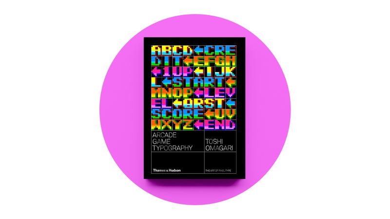
Arcade Game Typography by Mr Toshi Omagari; image courtesy of Thames & Hudson