THE JOURNAL
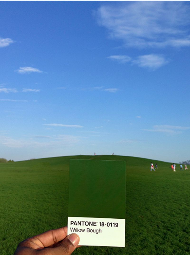
Springtime for hipsters: photographer Mr Paul Octavious refocuses his Pantone Project on MR PORTER’s palette for the season .
As the “great dress debate” so recently demonstrated (“Are you seriously telling me you think that it’s blue and black? I feel like I don’t even know you any more!”), colour can sometimes play tricks on us. This is partly why in 1963 Pantone – the worldwide authority on colour – developed the Pantone Matching System, a range of numbered colour swatches referred to as common standards by designers, printers and photographers. With a Pantone book in hand, you can describe colours accurately, circumventing the vagaries of the English language. It’s not “a pale sort of orange-y peach”, it’s PMS 715.
Over the past couple of years, Chicago-based photographer Mr Paul Octavious has been on an extended mission to match the colours he encounters in everyday life with their closest Pantone swatch. When he finds a match, he takes a photograph, holding the swatch up in the foreground. He’s been posting the images on his Instagram account – which now has more than half a million followers – with the hashtag #thepantoneproject.
Mr Octavious is a self-made photographer who started out with a passion he was determined to develop into a career. “I was fun-employed at first,” he says. He began making up personal projects and posting the results on the internet. On the day he bought his first serious camera, he joined a Flickr group called Project 365 which challenged users to post a new photo every day for a year.
The more of his distinctive photography he put online, the more people noticed – and the offers of paid project work soon followed from brands as diverse as McDonald’s, Nike, Mercedes and Hermès.
Now that spring has finally sprung, we asked Mr Octavious to send us real-world examples of this season’s key colours. And then we did some Pantone pairing of our own by cherry-picking some key seasonal products to match.
Pantone 214
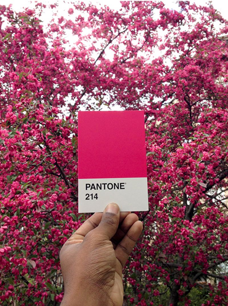
This shade might seem a little difficult to pull off, but it can work well as a summery accent, for those looking to grab attention. In the context of sports-inspired pieces, it also makes a lot more sense – see the day-glo flashes of Pantone 214 on sneakers from Valentino and Burberry Prorsum for spring 2015. Roughly 4,000 miles from the runways of Paris and London, however, Mr Octavious spotted a blast of good old 214 in his own neighbourhood. “When the tree outside my home in Chicago blossoms during spring it looks like the largest piece of cotton candy you’ve ever seen,” he says.
what to wear
Pantone 18-4525 Caribbean Sea
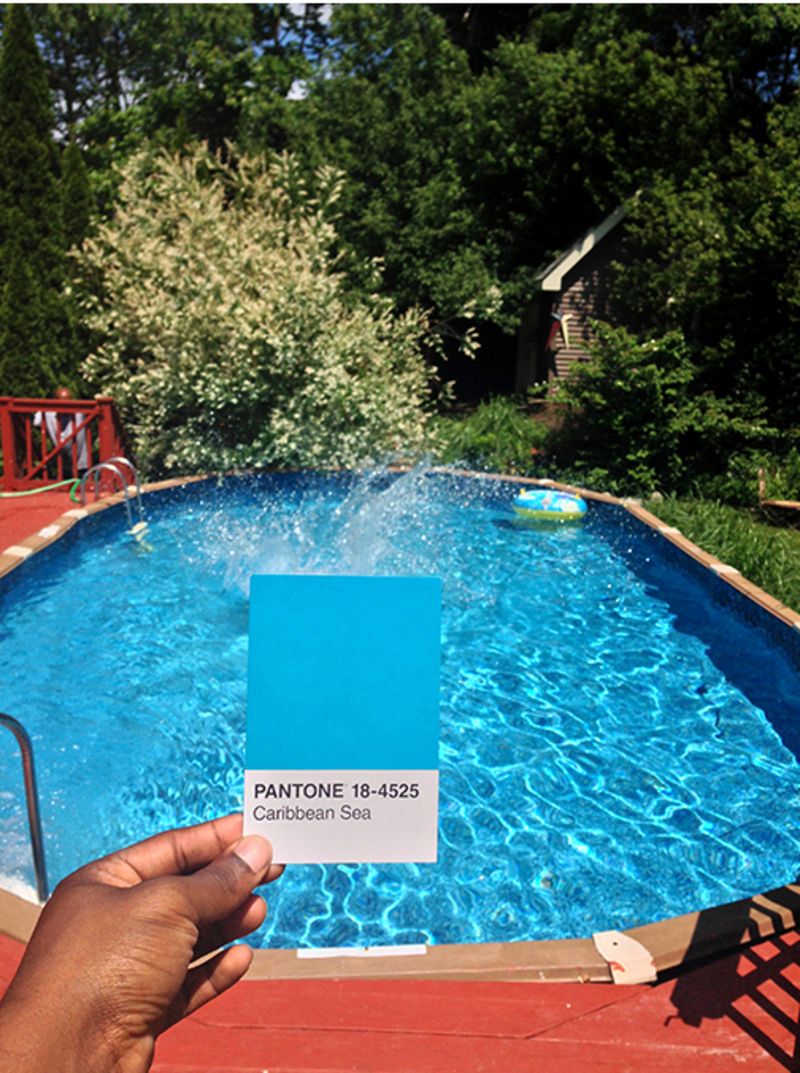
This is more or less the colour that caused Mr David Hockney to up sticks from Bradford (PMS 431) and move to California. But while it’s only in certain places around the globe that you might find this kind of “A Bigger Splash” shade naturally, there’s plenty of it in this season’s clothing, with notable offerings including those from Mr Raf Simons and Maison Margiela.
“This is the pool at my parents’ house in Connecticut,” says Mr Octavious. “We were always told not to jump in. Someone’s breaking the rules here.”
what to wear
Pantone 7726
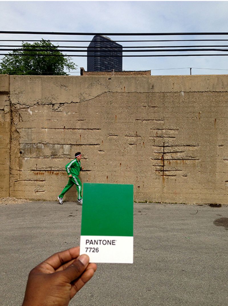
Some of the less Pantone-savvy among us might refer to this colour as “racing green”. Some might associate it with emeralds, or school blazers. Those who have been paying attention will notice its liberal use in the current collection from Sweden’s Acne Studios. But it hit Mr Octavious at what looks like at least one or two miles per hour.
“I carry my pack of Pantone cards around with me at all times and when I saw this runner in an old-school tracksuit and headband, I had to scramble to find a match,” he says. “Then I had to run alongside him for a while before I got the right shot.”
what to wear
Pantone 14-0852 Freesia
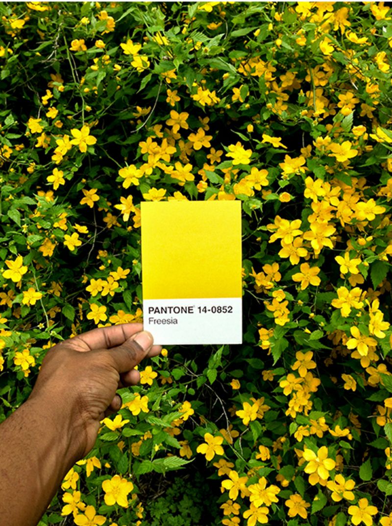
What’s more summery than the number “14-0852”? Well, many things. Thankfully, Pantone has appended a title to this swatch, “Freesia” which is a little more suggestive. In clothing, such a bright shade is best kept to accessories, but whether you wear it or see it by the roadside, its appearance at this point in the year means one thing: it’s almost shorts time.
“As a kid growing up in Bridgeport, Connecticut, whenever I saw this yellow freesia plant flower I’d know summer was on its way,” says Mr Octavious. “Looking back I think this was probably when I started to observe things around me and how they change seasonally.”
what to wear
Pantone 18-4530 Celestial
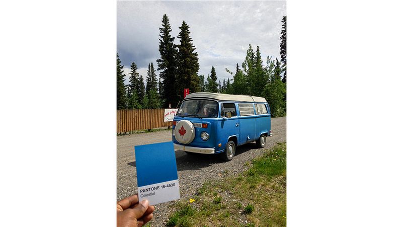
This rich royal blue is the colour of the season, visible in collections from the likes of AMI, Margaret Howell, Etro and Balenciaga. Not that it would matter to the owners of this Scooby-Doo-esque motor. “This is from a road trip to the Yukon in Canada,” says Mr Octavious. “We stopped in a campground for lunch on our way to the Arctic Circle and got chatting to a couple who owned this bright blue VW campervan.”
what to wear
Pantone 1797
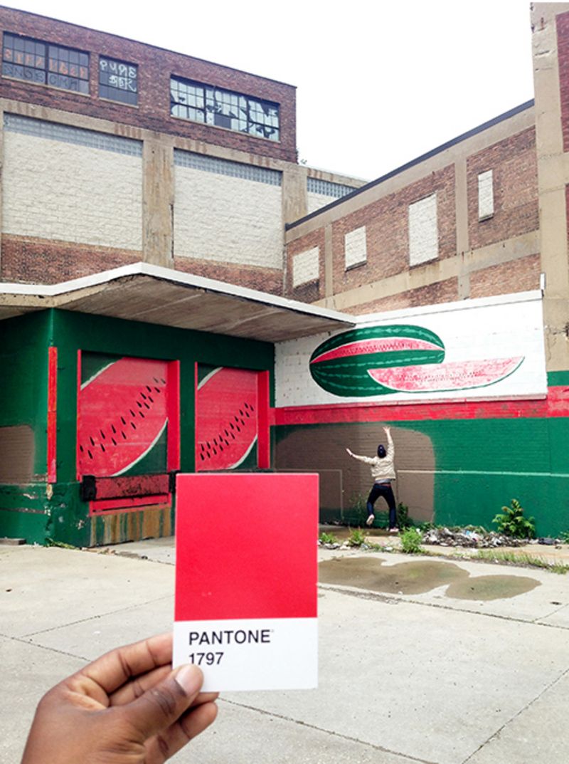
Where scarlet is brazen, 1797 has a freshness to it that makes it a softer and more fun choice for spring. This season, it’s being championed by the Americans, with choice offerings from the likes of Mr Mark McNairy and Freemans Sporting Club. Perhaps those New Yorkers, too, stumbled across an abandoned watermelon factory, as did Mr Octavious when he took this photograph on Chicago’s south side. “I’m not a big watermelon fan,” he says, “except in giant mural form.”
what to wear

MR OCTAVIOUS RECOMMENDS SEVEN INSTAGRAMMERS TO FOLLOW
Mr Octavious is a dab hand at engaging with the Instagram community, and has trawled far and wide in search of photographic inspiration on the platform. Here are his top accounts.
1. @jimmymarble – a photographer with stunning composition and use of colour
2. @chrisburkard – awe-inspiring landscape photography
3.@adamscarpenters – a comic genius who uploads a different dance every day
4. @brockdavis – one of the most creative uses of Instagram I’ve ever seen – check out his Vine films
5. @dschwen – a truly innovative designer and photographer
6. @cschoonover – one of my favourite portrait photographers
7. @moneal – a photographer, designer and best friend