THE JOURNAL

Mr Jeremy Leslie. Photograph by Mr Anton Rodriguez, courtesy of magCulture
The best-looking magazines on the planet, as chosen by design guru Mr Jeremy Leslie.
If you need an opinion on magazines, you’d be hard pressed to find anyone more knowledgeable or, more importantly, passionate than Mr Jeremy Leslie, the man who set up magCulture in 2006. What started out as a blog for fans of the medium soon developed into an internationally recognised resource for all things magazines, and now comprises a design studio and bricks-and-mortar store.
To coincide with New York Design Week, magCulture is setting up shop at Vitsœ (the company that has been making the furniture of industrial designer Mr Dieter Rams since 1959) on Bond Street until 29 May, ahead of magCulture’s conference, ModMag NY Edition, at Parsons School of Design. As he prepares for this event, we asked Mr Leslie if he could discuss five magazines that best represent “good design”. Find out what he said, and which titles he picked, below.
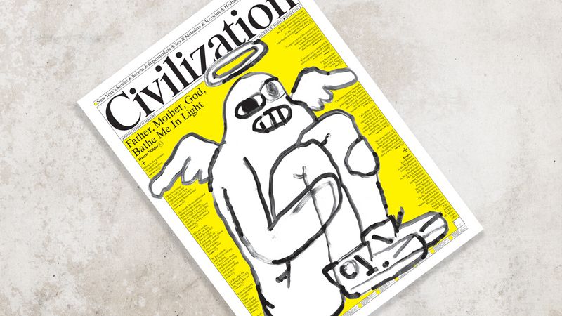
Civilization

Issue 1, April 2018. Photograph courtesy of Civilization
“Richard Turley’s award-winning work for Bloomberg Businessweek rewrote the rules of magazine design and reminded us that great editorial design stems from clear ideas expressed strongly,” says Mr Leslie. “He’s since left publishing but finds himself attracted back for one-off projects. These have included an astonishing recent issue of Mushpit and now Civilization, a self-published broadsheet newspaper that seeks to be a new voice of Turley’s adopted home of New York. This is design pushed beyond the edge of normal, and its packed pages break rule after rule, but it works. We desperately need more mavericks like Turley.”

The Gentlewoman

Ms Alison Janney, Issue 17, Spring/Summer 2018. Photograph by Mr Colin Dodgson, courtesy of The Gentlewoman
“The consummate independent magazine, conceived and executed with absolute clarity of thought and ambition. Art director Veronica Ditting has reinvented the design language of the woman’s magazine. The usual fluffiness has been replaced by a strict modernist type aesthetic that provides a strong but flexible framework for great writing and strong art direction. The Gentlewoman is instantly recognisable, even as it subtly adjusts its visual themes across every issue.”

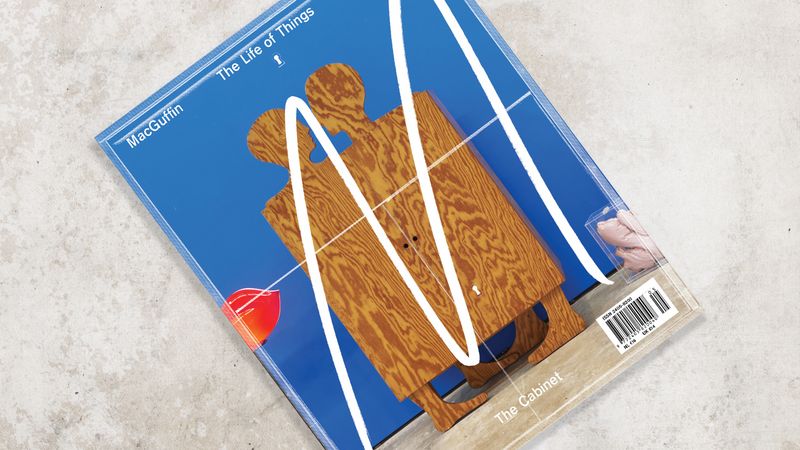
MacGuffin

Issue 5, December 2017. Photograph courtesy of MacGuffin
“After only five biannual issues, this Dutch magazine is winning every design award available. A clever editorial premise – the use of a single object as a springboard for story research – allows it to start with design and end up investigating almost any discipline: art, craftsmanship, anthropology, etc. Sandra Kassenaar’s designs for the magazine follow the editors’ premise that the magazine is an exhibition, providing a set of elements that respond to the many types of content and bind the different stories together as a satisfying whole.”

Spin/Adventures in Typography

Issue 2, December 2017. Photograph courtesy of Spin: Adventures in Typography
“After his publishing company Unit Editions researched and published Impact, a double-volume collection of design magazine front covers from the past 100 years, designer Tony Brook saw an opportunity to make his own magazine about type. The result is this slim but gorgeous publication that celebrates both the print process and the raw shapes that make up letters. Part of the appeal is the paradox of rough work being the subject of stunning production values. Another part is the wit and joy for what is so often an austerely serious subject.”

The California Sunday Magazine

Mr Jerry Brown, Issue March/April 2018. Photograph by Mr Carlos Chavarría, courtesy of The California Sunday Magazine
“This bi-monthly newspaper supplement is as notable for the elegance of its distribution method – it is produced independently, but goes out with a number of California newspapers as their Sunday supplement – as it is for its beautifully understated art direction and design. Leo Jung oversees pure visual storytelling, using great images and employing type with superb care. The California Sunday reminds us that strong typography needn’t be about bombast and noise.”
GRAPHIC DESIGNS
