THE JOURNAL

The Gallery at Sketch, London. Photograph courtesy of Sketch
From the latest hotel openings to this season’s runway shows, here’s how the prettiest shade became the hottest colour.
No, it’s not your rose-tinted glasses: the world really has turned pink. Or, more specifically, it’s turned a light dusky hue technically known as Baker-Miller Pink, but which you’ll probably be more familiar with as “millennial pink”. The shade has been scientifically proven to calm aggressive behaviour, even used in the 1960s to paint US correctional facilities, but more recently it’s provided an extraordinarily popular and durable design trend: other colours come and go, but pink has persisted, with Rose Quartz named one of Pantone’s colours of the year in 2016.
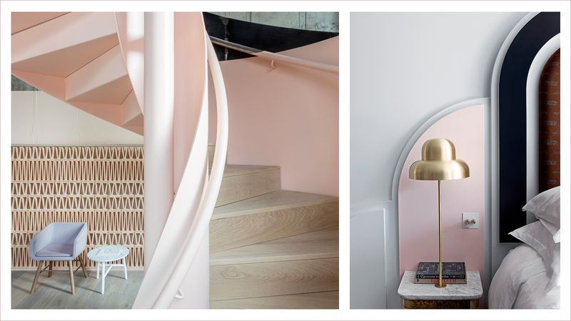
It tints everything on MR PORTER across the SS17 collections, from Bottega Veneta to Oliver Spencer, Sacai to Gucci, John Elliott to Giorgio Armani. Meanwhile, the hottest openings in hospitality are making nods to Mr Wes Anderson’s The Grand Budapest Hotel’s riot of roseate: Mr David Shrigley’s heavily Instagrammed interior of London’s Sketch is salmon from wall to banquette; in the same city, the hotel of the moment, The Henrietta, is flush with fuchsia; while the newly opened Barceló Torre de Madrid by Mr Jaime Hayón is a deep blush.
With summer finally on its way, we’re only going to see more of these coral tones, from gently sweating glasses of Whispering Angel rosé in the south of France to lightly-seared beef carpaccios on the Amalfi Coast.

Looks from Sacai, Bottega Veneta and John Elliott. Photographs courtesy of the designers
We are far from reaching peak pink, it seems, which begs the question: where does its popularity come from, and where might it go next? “We’re in a period where using colour is less about complementing a design and more a way to create shock and surprise,” explains Mr David Shah, publisher of Pantone’s biannual colour planner and guest lecturer at the Royal College of Art. “Colour trends used to be linked to seasons, but that’s become more complicated in our digital, see-now-buy-now world. Whether you’re in fashion or interiors, styling and image making have become crucial – often far more so than cut or quality. Colour is a way of creating a strong visual impact at first glance, which is vital in giving you the visual punch you need to survive online.”
It’s surprising that pink has such a strong visual impact because, technically speaking, the human eye shouldn’t be able to perceive it at all. Our retina contains around seven million cone receptors that register red, green or blue (RGB). We detect the full light spectrum of violet, indigo, blue, green, yellow, orange and red by firing up one or two of those RGB cones in combination: yellow is perceived by a combo of red and green cones, for example. Pink isn’t on the light spectrum and, in many ways, it’s a biological mystery that we can detect it. Like grey, it requires all three RGB cones to fire up simultaneously, meaning that there’s far more malleability to the pink colour group: more blue and it becomes dusky; more red and it becomes coral; more green and it becomes clay. It also means that pink can be used to complement the full spectrum of colours by dialling up or down a constituent part.
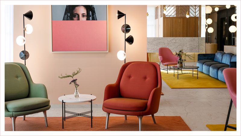
Left: Leman Locke, London. Photograph by Mr Nicholas Worley, courtesy of Leman Locke. Right: The Henrietta, London. Photograph by Mr Karel Balas, courtesy of The Henrietta
“It works as well on a sweatshirt as it does on a wall – it’s universal,” explains designer Mr Luke Edward Hall, who uses it in everything from textiles to pottery (not to mention his website and the walls of his London studio). “The dusky shade can, in a funny way, feel quite neutral – like a more fun grey. I think it’s lastingly versatile.” This versatility means that different shades of the colour can have radically different effects. “That really bright shade of pink – Barbie pink – would not have so much mass appeal,” Mr Hall explains. “Dusky pink is a lot safer, hence why it works in my shared studio space, and it feels far more contemporary, too. Pink also translates as well on screen as it does in real life.”
One of the undoubted engines of millennial pink’s success is its screen appeal. In an age where brands live and die by Instagram likes, colours that stand out on cluttered news feeds have currency (millennial pink is also known as “Tumblr pink”, after all). One person who knows this more than most is Ms Scarlett Curtis, resident Gen-Z columnist for The Sunday Times Style and a fan of all things fuchsia (recent column: “Pink as a way of life”). “Young people are more powerful than ever because of social media and our ability to communicate directly with one another,” Ms Curtis explains. “To me, pink is a colour that was historically used to undermine women as ‘girly’ and therefore ‘less than’ men. The last few years have seen an explosion in feminism online, with younger and younger girls reclaiming it as their own. It’s about rewriting the associations with traditional gendering being a negative and turning it into a powerful positive.”
Barceló Torre de Madrid. Photograph courtesy of the hotel
So for Ms Curtis and her teenage peers, pink’s power to challenge and subvert social stereotypes is part of its mass appeal, explaining why the pink “pussy hat” became such a potent political symbol during the backlash against President Trump’s inauguration. It also goes some way to explain why the colour has been so wholeheartedly embraced by the gay community: the pink triangle, or rosa winkel, was once used as a Nazi concentration camp badge for homosexual untermensch, but now sits alongside the rainbow flag as an emblem of global unity and defiance. What is perhaps more surprising is pink’s adoption by mainstream heterosexual culture, to the extent that it no longer draws a second glance on a Fred Perry shirt or straight city boy’s tie. Why do some of the most stereotypically “alpha” males now wear pink alongside teenage feminists and millennial gay men?
The term “metrosexual” was coined in the 1990s to describe a new wave of urbane, sensitive souls who took care of their appearance – and their women. This movement has gone from wave to tsunami, becoming the new normal in the West and causing reactionary movements such as MGTOW (Men Going Their Own Way) to decry the death of masculinity. The fact is, feminists may have reclaimed pink as a colour of power, but it can be equally powerful on straight men: it demonstrates a confidence and insouciance that is incredibly macho. “Pink was once used to signal gendered products – children’s clothes, razors, mobile phones – but so-called millennial pink is now about gender inclusivity,” explains Ms Julia Hobbs, fashion news editor of British Vogue, who also compiles Condé Nast’s seasonal trend report. “Femininity has become a power word, and softer shades of pink transmit that thinking at a glance: it’s become impossible to ignore its commercial and social value. When worn by men it has a certain continental fearlessness and communicates a sense of confidence; it’s brazen.”
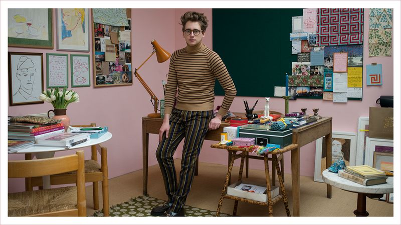
Mr Luke Edward Hall at his studio in Camden. Photograph by Ms Rebecca Reid
So, powerful on women, brazen on men, pink has gone through quite a transformation since its 1980s bubblegum Barbie days. It has now grown, amoeba-like, into an all-consuming colour palette: as at home in interiors as it is in architecture, fashion or branding. Pink’s popularity can only be explained by a unique combination of identity politics, social media disruption, biological perception and commercial adoption. It has made the transition from being a playful, “girly” colour to being a universal hue, joining the pantheon of grey, black and white as timeless tones. Although the media hype around so-called “millennial pink” is sure to bring some form of popular backlash, the colour’s inherent flexibility means that it will just morph into another popular guise. Pink really is the new black.