THE JOURNAL
Not so long ago, those of us whose job it is to talk about luxury watches would give an inordinate amount of consideration to just three principal areas. Those were the movement that made the watch tick, the case in which it sat and the heritage from which it sprang. It seems strange to look back now and realise what a minor part of the story was taken up by the main thing you see when you look at a watch, its dial. That’s partly because a lot of the time there really wasn’t that much to talk about. Colour was rare, embellishment was painfully considered and rules – about how a watch should look, what traditions and genres it cleaved to, how it was expected to be worn – were heavily presumed and dutifully followed.
This is not to say there weren’t arrestingly beautiful designs. But in terms of what gave a watch its character, its talking points, its currency as a piece of fine watchmaking and even its sense of creative expression, the dial was often surprisingly low down the list.
Spin forwards to 2023 and you find the watch world losing its collective mind over the multi-coloured dial of a new Rolex that was announced at Geneva’s Watches and Wonders trade extravaganza. There were other stories to come out of March’s show, but you know what? Not really, because the appearance of a steel Oyster Perpetual with a dial graphic of multi-coloured bubbles against a turquoise background, from a brand known for the tortuously austere sense of control it exerts over any aesthetic development, seemed bordering on the seminal.
It confirmed that nowadays, even at Rolex, the old rules about dials no longer apply. Colour, pattern, texture and expression are firmly on the agenda and style, differentiation and fun have become essential horological qualities, expressed in dial design. In 2023, the dial really is the story.
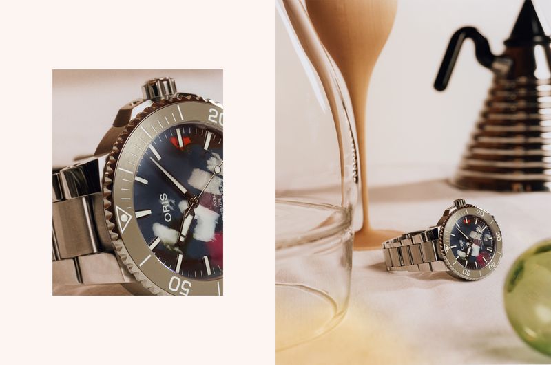
Nowhere is that clearer than at Oris, which has gifted the world arguably the most kaleidoscopic, riotously clashy dial concept of all. Its Aquis Date Upcycle models are made from recycled plastic waste salvaged from the ocean. Since the process of squishing plastic together and then cutting it into a flat dial is completely randomised, each one is unique.
The effect recalls somewhat the look of old-school watch dials cut from semi-precious stones, if you put that through a Mr Jackson Pollock filter. The result, however, is something unique, expressive and glorious, which not unimportantly also supports a positive view around sustainability and the environment, what Oris calls “change for the better”.
In the past, that might have been a limited edition of a few watches made for ticking PR boxes, but Oris has put no limit on these. Not least because its CEO, Mr Rolf Studer, and his team are well aware that they are no longer in the business only of providing customers with a single watch to wear for life. For that, the Upcycle would be somewhat de trop, but as something brought out for particular outfits or moods, it offers a lot.
If multi-colours are not your thing in dials, how about going for texture? Texture in a watch dial once referred to little more than the style of guilloché engine turning or perhaps a mild sunray polish. Today, the possibilities of mixing up rough and smooth are giving watch designers myriad new options.
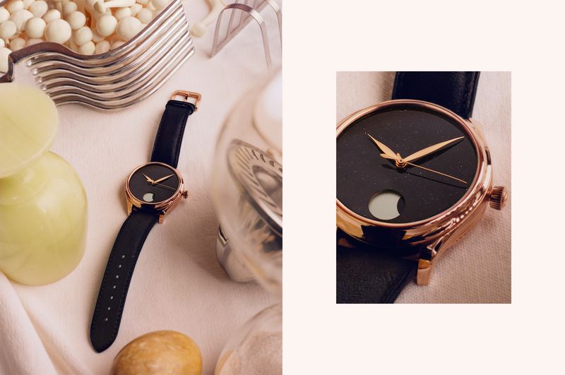
Last year, Patek Philippe, of all brands, released watches with heavily stippled dials designed to recreate the rough-hewn texture of vintage camera cases. H. Moser & Cie. has been playing with heavy laser-cut textures winking out beneath limpid layers of enamel in certain Endeavour models, while offering a completely different kind of dial statement, in the night-time shimmer of aventurine, with its Endeavour Perpetual Moon.
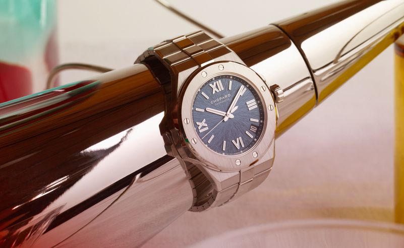
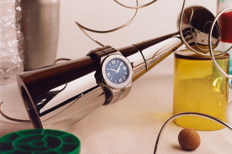
The spiralling ripple of the dial texture of Chopard’s Alpine Eagle sports-luxe range is a notably unusual and effective departure from the norm that seems both luxurious in its rippling swirl, but deep enough and rough enough to give added richness to the colours laid over it – greys, greens, blues, browns and, a new addition in 2023, salmon pink.
Similarly, this year’s revival of the 1976 Ingenieur, IWC Schaffhausen’s own sports-luxe classic, finds new life both in Mr Gérald Genta’s celebrated original case design, but also in the cross-hatch dial pattern that was a key part of the original’s allure. Then, it was a subtle but unusual motif that did just enough to coarsen the surface and prevent a glossy sheen. Now, it’s much more exaggerated: a deep-etched checkerboard that ripples and pops in your Instagram feed, particularly when presented not just in the canonical black version, but in a vibrant shade of turquoise.
“Colour, pattern, texture and expression are firmly on the agenda and style, differentiation and fun have become essential horological qualities, expressed in dial design”
A look back at other watches of the 1970s tells us that, really, there is nothing new in the idea of watch dials delivering a strong visual kick, whether through novel patterns, colours or graphic effects. Back then, as now, traditional watchmaking was having to make a case for itself in the face of a digital takeover and to show that it could be modern, vibrant and funky, rather than patrician and serious.
Much of what worked then works now. Gradient dials, with saturated colours fading at the edges into shadow, were a huge trend then and are again today. Zenith’s current revival model of its 1971 Defy, which as a fabulous dial in a crimson gradient animated by unusual block hour markers, is completely accurate to the original and feels all the more contemporary as a result.
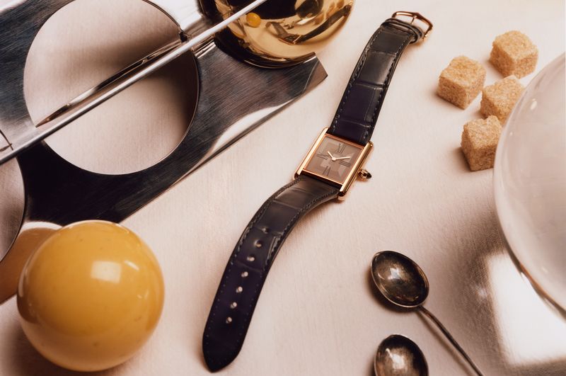
It was also the moment when Cartier took its 1920s classic, the Tank, and gave it a disco-era glow-up in the form of the Tank Must, with dials in colours such as maroon, green and blue. The latest upgrade of the Tank Louis Cartier seems to take that idea and orient it more towards a cocktail soirée than a nightclub. This is largely thanks to a subtle but beautiful visual effect achieved via a form of electrochemical engraving, in which the square-form motif shimmers and changes beneath the lacquer surface as you move the watch around. It’s bewitchingly elegant and proves that even the simplest classic design can be renewed by effective dial variations.
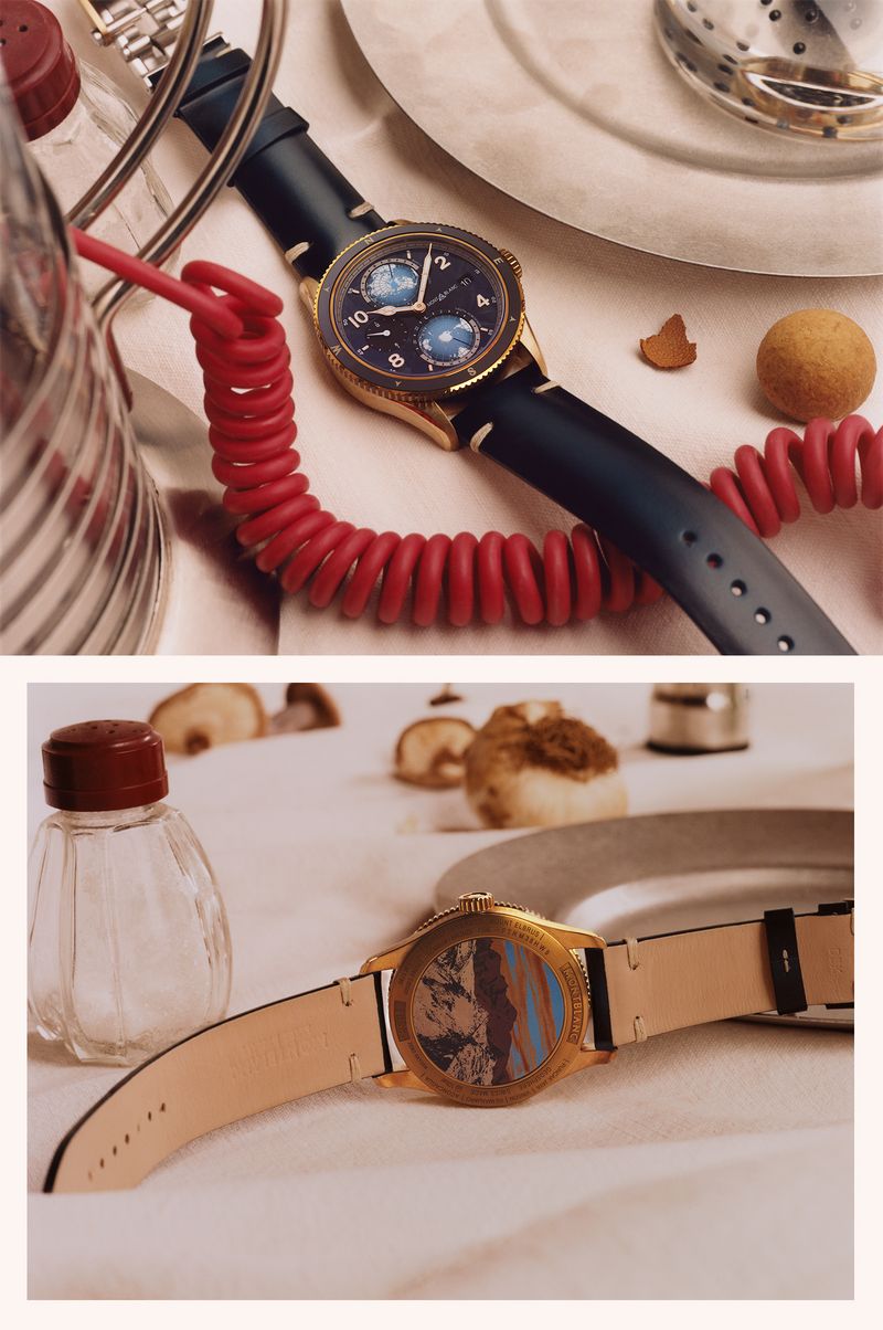
A well judged dial also enables you to pull off the unexpected. I wouldn’t have had Montblanc on my list of brands most likely to succeed in the well-worn genre of sports/diving watches, but its 1858 Iced Sea collection has been a genuine sleeper hit, helped along by an eye-catching dial motif inspired by glacial crevasses. If you’re named after the highest mountain in Western Europe, you probably do have licence to make mountaineering the central theme of your sports watches.
The 1858 Geosphere 0 Oxygen combines Montblanc’s already unusual Geosphere concept – a GMT travel watch with rotating time zone hemispheres – and its equally off-beat zero-oxygen tech (no oxygen in the watch means no fogging at altitude, apparently), with the addition of a bronze case and the Iced Sea dial style. The result is a watch that is practically mannerist in its attributes and pays no mind to tradition while packing complications, colour, pattern and ambience into a unique concoction.
To paraphrase the American singer Ms Dinah Washington, what a difference a dial makes, 24 little hours.