THE JOURNAL
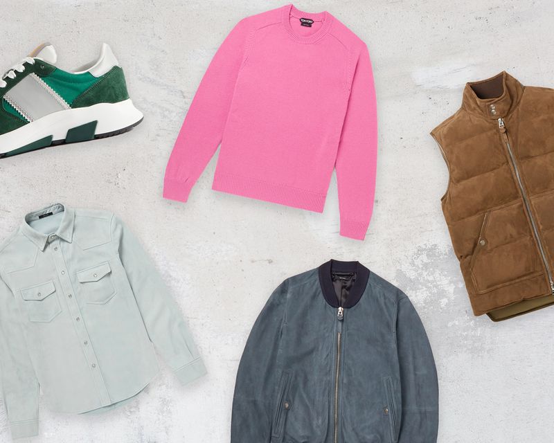
When we believe in something at MR PORTER, we invest in it, and we do so with gusto. Go hard or go home, if you will. This is true of mental health and our Health In Mind campaign. It is true of our commitment to sustainability and our Craftsmanship Code. And it is true of nice, shiny things that TOM FORD makes. Indeed, so diverse is the vast array of items from the Texan designer on MR PORTER that we have decided to split our favourite pieces up into some of our favourite colours. Call it obsessive organisation, call it colour blocking – whatever happens, these are failsafe investments for a quick-fix of sophistication.
Why now? Because soon it will be time to take off those shorts and sliders you’ve been living in for the past few months and slip into something a little more mature. Being an adult can be tough sometimes, but a piece or two here might make things that bit easier.
01.
Jade green
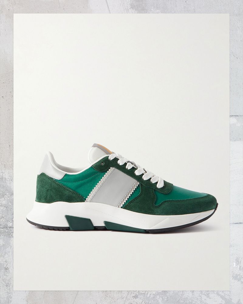
“Jade Green” may sound like the name of one of your mum’s best mates, but it’s actually a vibrant, flattering and versatile colour that we reckon is lacking from your wardrobe. To avoid running the risk of looking like the Emerald City in The Wizard Of Oz, we suggest taking small steps to add it into your fits. Literally. A pair of athletic-style sneakers with a pop of the vibrant colour is an easy place to start. Or, if you’re looking for a more subtle approach, try ditching the black and brown accessories for a brighter option.
Wear it with
02.
Duck-egg blue
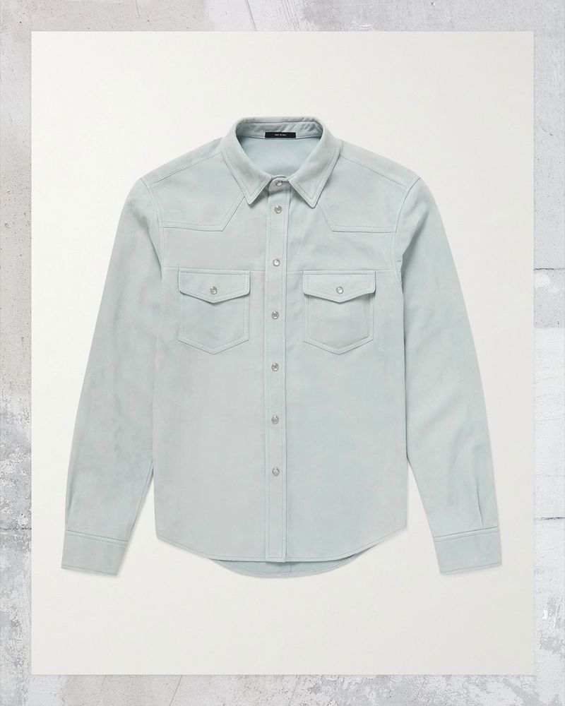
Good things happen in the space where blue and green meet. It’s home to teal, aquamarine and, our personal favourite, duck-egg blue, a soft, pastel shade that TOM FORD has applied to winning effect on this suede western overshirt. It’s a piece typical of the Texan-born designer, who is known for his luxurious reimaginings of American style classics. And it’s not his only use of duck-egg blue: the colour can also be seen on cotton- and silk-blend polo shirts and on the suede panelling of sneakers.
Wear it with
03.
Pink
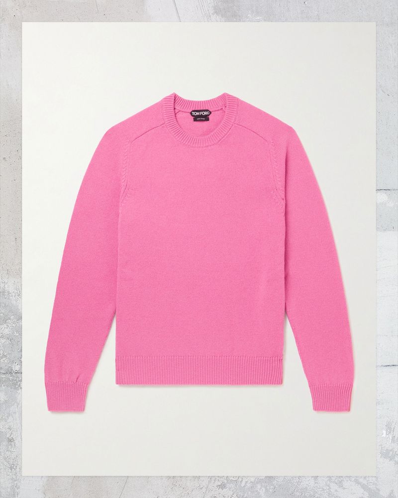
The word “pink” only came to mean the colour in the 17th century. It derives from an old Dutch word meaning, loosely, “something small and sharp”. It came to be associated with the colour thanks to the Dianthus flower, whose petals are delicately serrated (this, by the by, is why “pinking shears” are so named) – and also, well, pink. Something to ponder as you dress for the day in your cashmere crew-neck sweater and beautifully soft cotton T-shirt, and slip your Italian-made pebble-grain leather cardholder in your pocket.
Wear it with
04.
Petrol blue
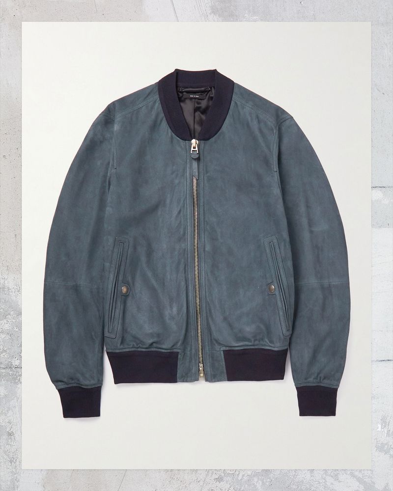
What petrol isn’t is blue. The greyish, greenish hue that shares its name with what in the US is known as gas, but isn’t a gas, is more likely to have gleaned the moniker from paraffin, a derivative compound. Or a sea bird called a petrel, which isn’t blue, either. It is, however, the favoured tone of recent times in interiors circles, and looks pretty sharp in clothing form, as demonstrated here. With its elevated takes on the bomber jacket, track jacket and sweatpants in the shade, TOM FORD’s luxurious pieces look, feel – and are – reassuringly expensive. Which is sort of like petrol these days, come to think of it.
Wear it with
05.
Tobacco
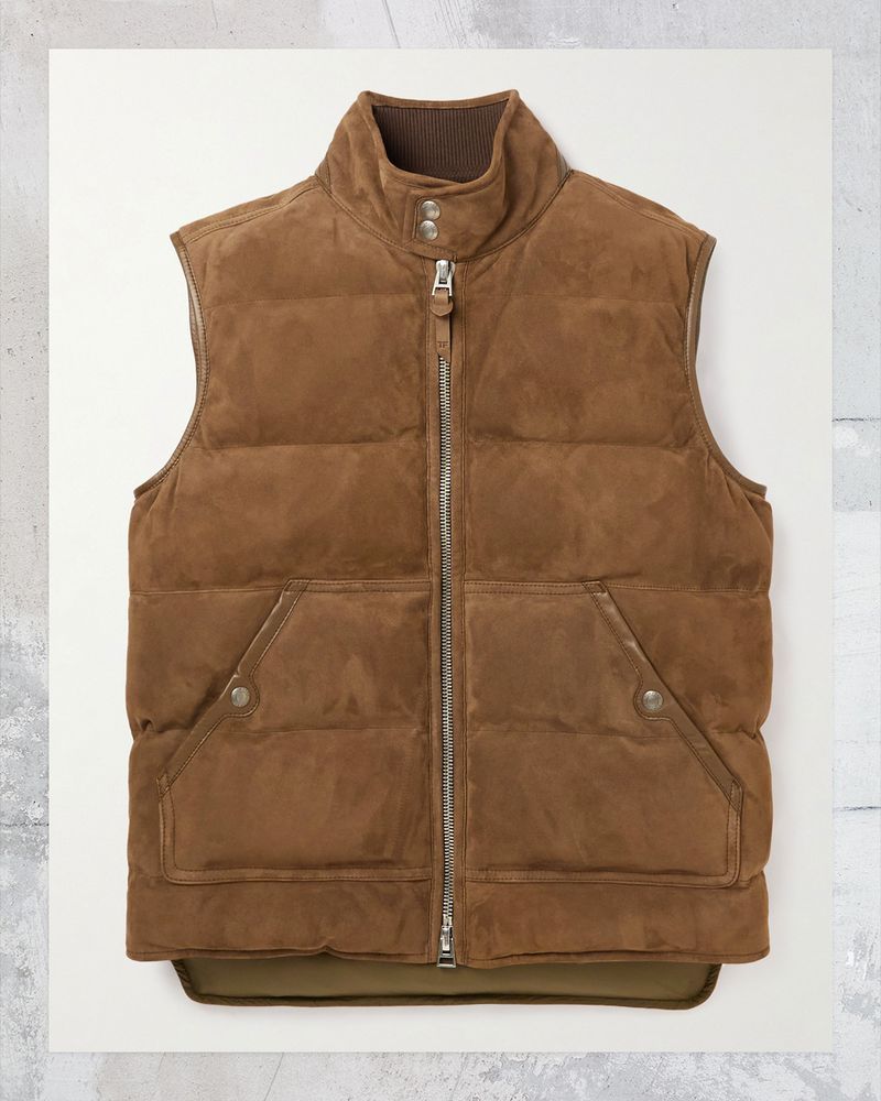
Did you know that someone who dislikes the smell of tobacco is known as a misocapnist? Interestingly, there doesn’t seem to be a word for someone who dislikes the colour, which is understandable when it looks as good as this padded gilet. It’s the perfect insulating layer for those in-between days when the weather is unpredictable. Add some warmth with a matching cashmere-blend rollneck sweater and finish with the suede Jackson sneakers for a sophisticated – dare we say smoking – look.