THE JOURNAL

Your wallet and your watch say a lot about the man you are. Here are a few ways to use them to tie a look together.
Colour coordination can be a risky business. When done properly, it can bring an outfit to life; done poorly, it can betray a serious lack of judgment. Mistakes are often made when too much faith is placed in crudely reductive maxims such as “the colour of a man’s belt should always match that of his shoes” – a perfectly sensible argument if your shoes are black or dark brown leather, but one that quickly becomes untenable when brighter colours are introduced. Red suede driving shoes and a matching belt? Please, don’t be that guy.
The secret to avoiding the “matchy-matchy” look is subtlety and a far more subtle way of introducing a pop of colour into your outfit is to focus on smaller accessories, such as your wallet and watch. These are the first two things that others notice about you, but they’re not so visually arresting that they dominate an outfit. Chosen carefully, they can also provide an excellent foil to some of this fall’s key shades: camel, bottle green and burgundy.
BROWN and FOREST GREEN
Brown leather is a classic choice for your watchstrap and wallet, and a logical alternative to the ubiquitous black. We especially like that shade of soft, earthy brown particular to Mulberry’s leather goods, as seen in this cardholder. It works particularly well with other natural colours, such as the verdant forest green (or fern green, or bottle green, depending on your preference) of this varsity jacket.
BLUE and CAMEL

Camel is one of the dominant trends for this coming autumn and winter. With designers such as Ami and Calvin Klein using their runway presentations to advocate heavy deployment of the colour, it’s worth looking to your accessories as a way of adding some chromatic contrast. Try this Balenciaga wallet and Uniform Wares watch – the deep petrol blue stands out against the sandy tone of this Valentino camel-coloured bomber jacket, like an oasis in the desert.
BLACK and RED
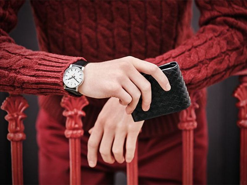
Black is the simplest choice for leather goods, and by far the most popular. As a result, it’s particularly easy to “match” your wallet and watchstrap – so easy, in fact, that you’ve probably done it before without even noticing. Black and red make for perennially happy bedfellows, but we’re steering clear of the pop art palette this season by toning down the red and opting for a rich, autumnal burgundy instead.
DARK GREEN and GREY
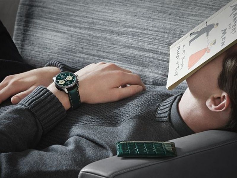
The leather strap and face of this automatic watch from Bremont come in a deep shade of British racing green that wouldn’t look out of place on a Jaguar E-Type. It’s seen here with a coordinating crocodile-leather cardholder from Santiago Gonzalez. The deep green hue almost appears black in low light, so it needs a neutral backdrop to allow it to shine. And this slate-grey jersey sweatshirt from Bottega Veneta is just perfect.
GREY and NAVY BLUE
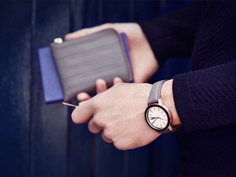
There’s a stark simplicity to the design of this Uniform Wares watch that, when combined with the concrete-grey leather strap, gives it a cool, minimalist, architectural feel. The colour is echoed in a zip wallet from Comme des Garçons, and the whole thing is pulled together with a Wooyoungmi cardigan, in navy blue – a colour that plays well with everyone.