THE JOURNAL

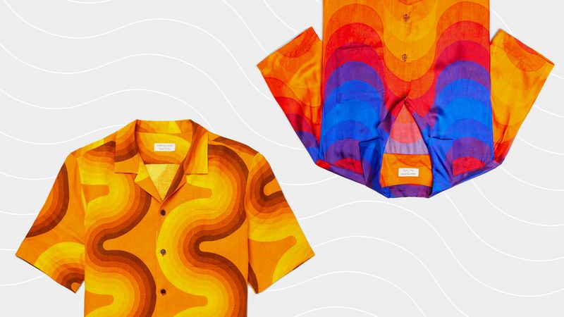
Get ahead of the curve in Dries Van Noten’s colourful separates.
“The main purpose of my work is to provoke people into using their imagination,” noted the Danish designer Mr Verner Panton. “Most people spend their lives in dreary, grey-beige conformity, mortally afraid of using colours. I try to show new ways, to encourage people to use their fantasy imagination and make their surroundings more exciting.”
More than a mission statement, this could be seen as a pop at mid-20th century Danish society and certainly the furniture design community from which Mr Panton emerged and soon rebelled against. Where his contemporaries limited themselves to a palette of coniferous wood tones, Mr Panton’s work was as unbridled as a rainbow.
His most celebrated piece is also his most ubiquitous. In fact, you’ve probably parked your bum on it (or at the very least a replica or copy). Realised in 1960 from ideas he’d been playing with over the previous decade, his stackable S-shaped chair was to be the first single-form injection-moulded plastic model to go into mass-production. And while it presented a turning point in the way furniture was manufactured, its aesthetic appeal was key. It became commonplace, but still somehow exotic; it was simplistic, but symbolic of the technical advances of the Space Age we had just entered. And when it was chosen as a prop for Ms Kate Moss’ famous 1995 Vogue cover, rather than fall into the backdrop, it held its own against the naked supermodel perched on it.
By the arrival of Mr Panton’s “Curve” pattern in 1969, the world had finally caught up with this Danish outlier. The work took Mr Panton’s penchant for the rainbow and its many hues and bent it into a continuous, undulating wave. Featured across wall panels, fittings and light fixtures, it captured a (possibly chemically driven) high point for the human cultural consciousness, when the future was not something to be feared. And then the wave broke.
For the past five decades, this particular piece is so intrinsically linked with the era that gave birth to it that it would appear out of place at any other time. What was once the holding image of zeitgeist very quickly gets thrown out when the world moves on and can even seem radioactive shortly after its moment has passed. It can take another maverick to know when it is safe to pick up again.
Fitting then, that that maverick is Mr Dries Van Noten. The Belgian clothing designer has repeatedly shown himself to be ahead of the curve; by adopting a similarly titled late-1960s pattern as the theme running through his SS19 collection, you can be sure that Mr Panton’s stock is on the rise once more. From variegated jersey T-shirts and printed denim jackets to voile shirts, this is wearable art at its finest. For those of us rallying against the “dreary, grey-beige conformity” of humanity’s shared wardrobe, at least there is now a rainbow peeking through.
Not over the rainbow
