THE JOURNAL

From architectural inspiration to home elevation, these creatives share the secrets for getting more followers.
Recently a video went viral on various social media channels documenting the phenomenon that is vemödalen: “the frustration of photographing something amazing when thousands of identical photos already exist.” The depressing notion is that with everyone now having a camera in their pocket and an array of editing techniques to beautify the results at their fingertips, it’s inevitable that, at some point, someone has already captured almost the exact same picture (of a snowflake, or a sunset, or a pair of hotdog-like legs) as you have.
If the originality of your feed bothers you, then it’s time to accept that classic design challenge: how can you take something that exists – the Instagram photo – and make it better? And to see how it’s done, you could do worse than checking out some of Instagram’s current design leaders. The platform, like the offline design industry, hosts a variety of different types of creative that can provide inspiration, from graphic designers and illustrators promoting their work (see @jgrvhvm) to architectural photographers (see @yukomouton) and art directors (such as @rvstapleton) who simply exercise a certain amount of design-conscious taste in all the images they capture. But, like all products of good design, the following feeds also have a lot in common, namely a certain geometric grace, consistency of aesthetic and economy of expression. Of course, when your main medium is the iPhone, and your image is always square, you also have to have supreme cropping skills, and these ‘grammers certainly don’t disappoint in that department. Scroll down to see how it’s done.
BEST FOR GROOMED ROOMS


Brooklyn-based Messrs Nick Nemechek and Tariq Dixon started a home inspiration and shopping site, trnk-nyc.com, to offer more stylish choices of furniture and interior accessories to the discerning man-about-Manhattan a little over two years ago. Their Instagram account was launched simultaneously.
As well as using the app as a platform to showcase their wares to a wider audience, the duo also treat their followers to interior tips and culinary tricks in accordance with the TRNK lifestyle as they live it. Instagram, they say, is also the best place to source new designers and talents both for inspiration and to stock in their store. “Their new discovery page really knows our taste!”
Shoot from this tip: “Be honest. Instagram audiences are surprisingly discerning and want authenticity.”
Follows: @kylehouck “For his breathtaking forestscapes – a swift virtual retreat from the busy city.”
BEST FOR ILLUSTRATION
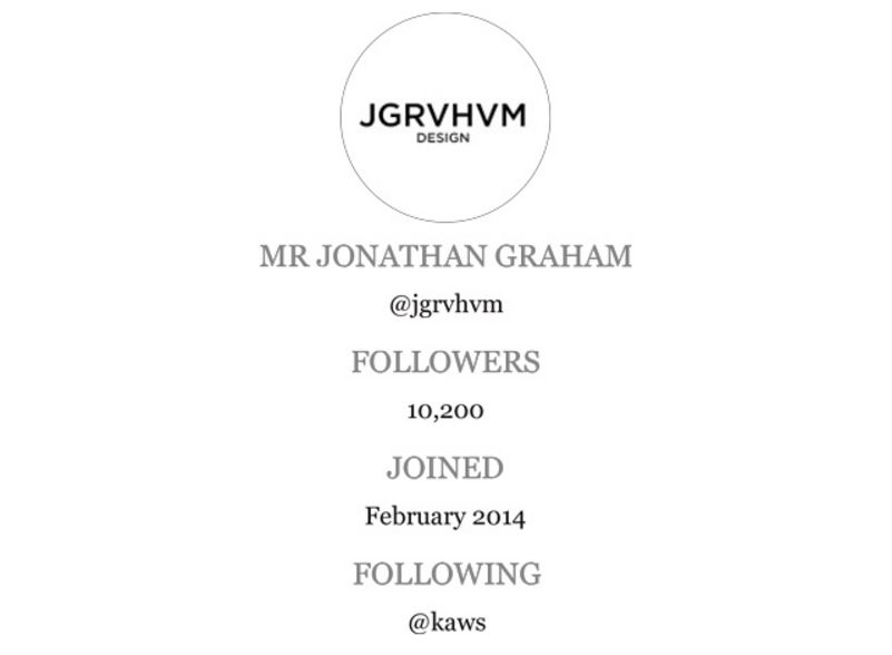
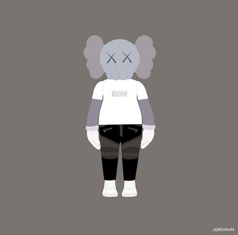
Mr Jonathan Graham is currently a student at the University of the Arts in London, but, impatient to get out there already, he is also working on building his own design brand (JGRVHVM), via Instagram. For the past year he’s been sharing his designs on the platform – clean-cut miniature illustrations of products, gadgets, clothes and accessories on colourful backgrounds that guarantee to cheer up any feed of an afternoon. “As a designer I love the way Instagram prioritises visual media without unnecessary layers and links,” he says. “My own current designs work particularly well in the shape, size and resolution level that Instagram offers.” Having already made some useful business and professional contacts through the platform, Mr Graham hopes for more Instafame and Instafortune in the Instafuture.
Shoot from this tip: “Don’t be too quick to post a design, give yourself at least a day to review it and look for any way to make it better.”
Follows: @kaws “For cute characters in crazy situations.”
BEST MONOCHROME
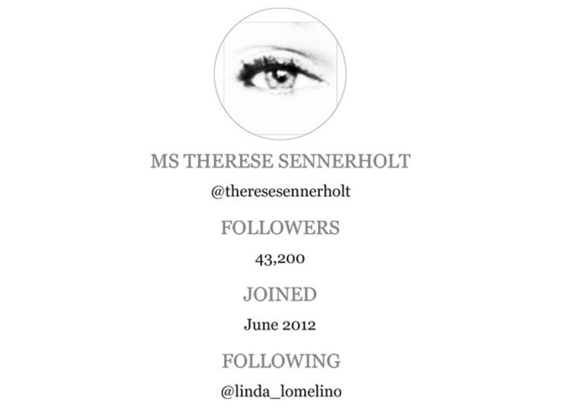
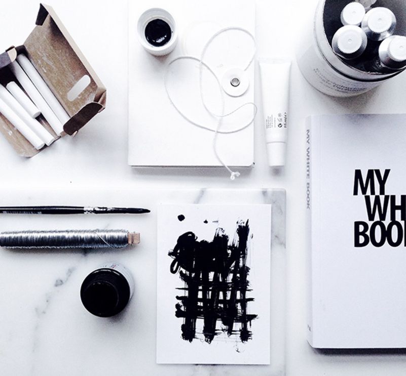
Art director and graphic designer Ms Therese Sennerholt is a Swede with a knack, not just for finding the right words, but for printing them bold and brilliantly in the right situation. For the past four years she has been working on her own range of minimalistic and (usually) monochrome products, posters and photo art, largely based on quotes about life. Her last collection of posters, called Shapes + Words, is exactly that – for every shape there is a word that complements it. Based in Stockholm, she was a reluctant Instagrammer at first “since I never used to take pictures”. But eventually she found herself getting into it, and today some 43,000 followers are glad she did. “It has made me develop my photography skills and forced me to get out of my comfort zone,” she says.
Shoot from this tip: “Find a style and stick with it. Defining some rules for the way you take pictures will make you feel more focused and more recognisable.”
Follows: @linda_lomelino “For colourful shots of sweets and treats.”
BEST VIEW OF TOKYO
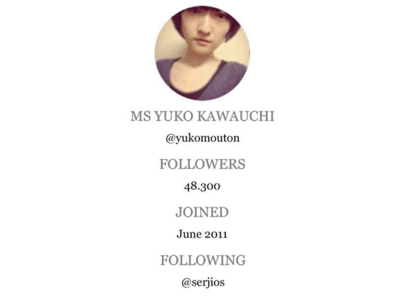
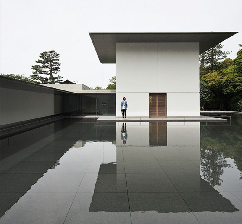
Japanese fashion designer Ms Yuko Kawauchi has an architectural approach to both her clothes – she launched the Black Mouton brand in 2009 – and her Instagram feed, which is heavy on the buildings, photographed in and around Tokyo. Perhaps it’s her mixed-disciplinary creative eye that gives her photos their fizz, or perhaps it’s the perspective-warping grids, with sharp angles in soft colouring, but whatever her secret, Ms Kawauchi knows how to move through space to make that space more moving. Originally, around four years ago, Ms Kawauchi joined Instagram to share pictures of her cat with her friends. But gradually she realised the platform’s potential for creative inspiration, and particularly to stretch its limits beyond the world of fashion. “I often find my inspiration from Instagram. I also want to be a person who is inspirational,” she says.
Shoot from this tip: “Determine the horizontal and vertical somewhere in the composition. Show a feeling of scale to architecture by including those who pass by.”
Follows: @serjios “For graphic and abstract walls and windows.”
BEST FOR ARCHITECTURE
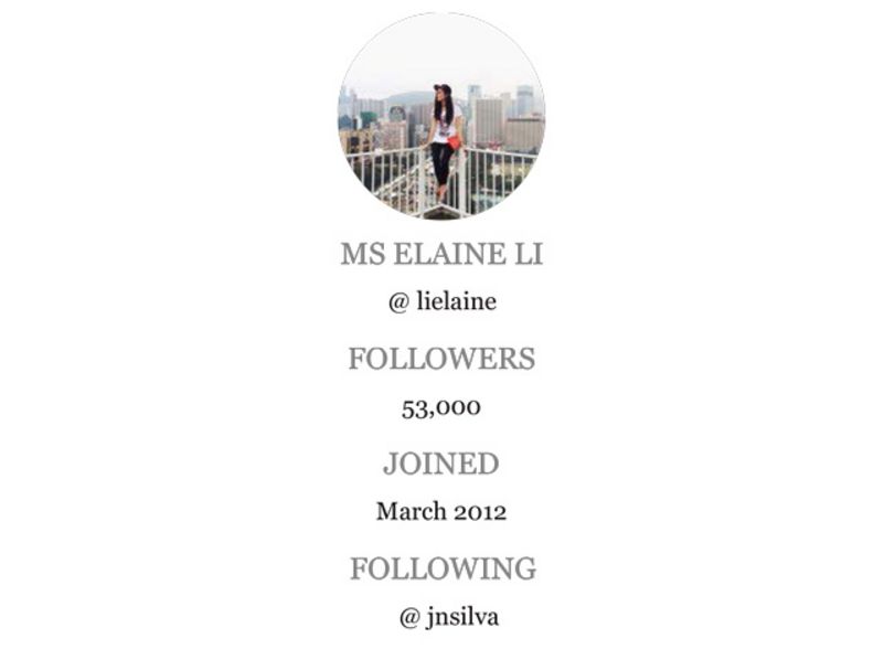
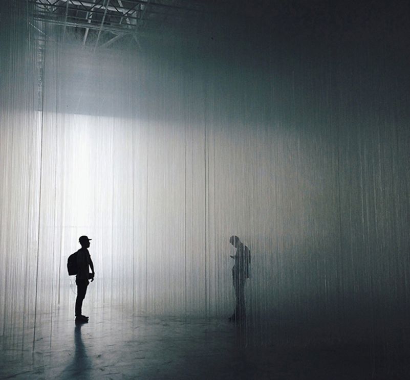
Born and raised in Hong Kong, Ms Elaine Li has spent two years living in Melbourne, four in Chicago and one in San Francisco. Now she’s back in her hometown, where she works as an art director and designer at an advertising agency, and shares her astonishing perspectives of city life and cutting-edge urban architecture on her Instagram feed with more than 52,000 followers. Ms Li joined in March 2012, recommended by a friend who knew she loved photography. Three years later and there’s been no looking back: “It has a huge impact on my life now.”
Shoot from this tip: “Share your work and process, your working space or things you see that inspire you. I think it’s always interesting to see behind the scenes.”
Follows: @jnsilva “For dramatically detailed, high contrast city scenes.”
BEST FOR WHITE SPACE
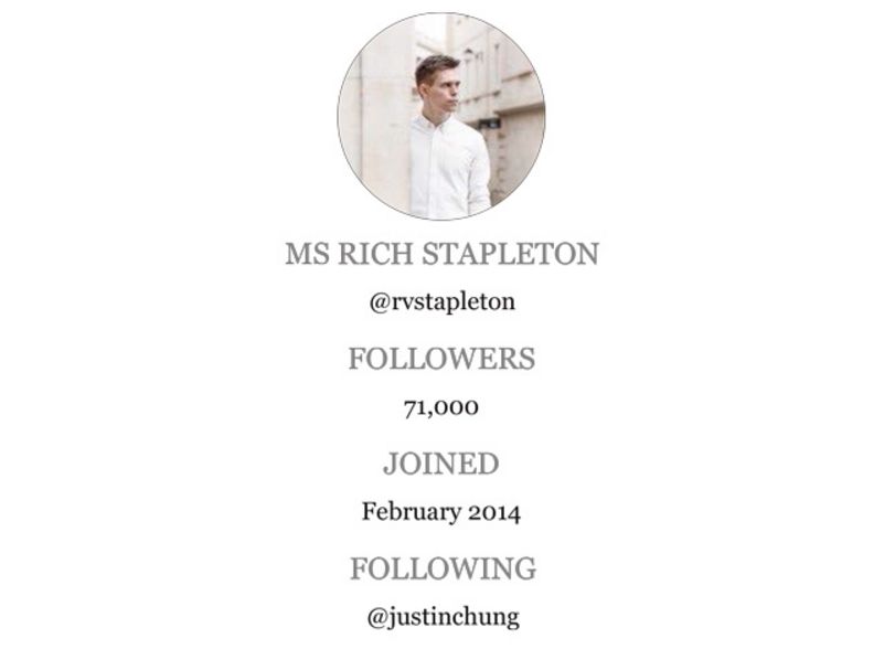
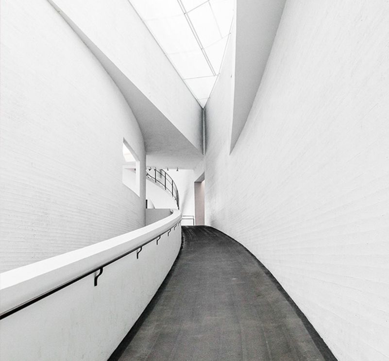
Mr Rich Stapleton’s Instagram feed is consistently, refreshingly stunning. Here is a man who, as the creative director for travel and lifestyle magazine Cereal, understands the power of white space. The backdrop is always big in Mr Stapleton’s images, whether he’s taking followers behind the scenes on shoots, treating them to still life arrangements of new grooming products and accessories, or documenting his own frequent travels, in Santorini, Florence or the Maldives.
Mr Stapleton grew up in Scotland, Belgium, England, Germany and Italy, and now calls the south-west city of Bath his home. Joining Instagram soon after Cereal was launched around two years ago, he wanted a tool “that would help me document my travels, capture places and objects that interested me, and as a way to record the development of my work, both as a designer and a photographer.”
Shoot from this tip: “Find your nearest window. The best way to take clean, crisp images is with plenty of natural daylight. Also, symmetry is very important, your Instagram images will be displayed in a grid after all.”
**Follows: **@justinchung “Justin is a very talented photographer with a great sense of style.”
BEST FOR COLOUR
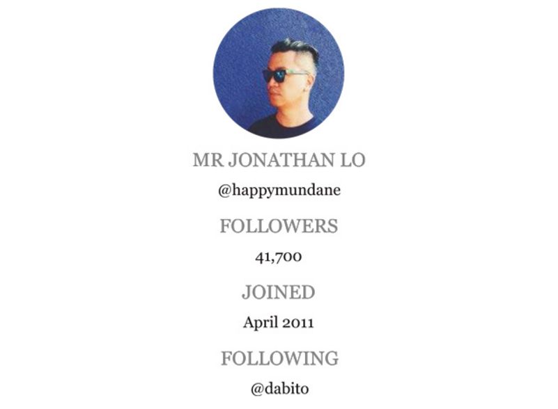
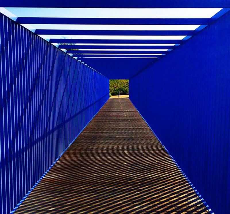
For those in need of a sunny Instaholiday, the feed of OC-based @happymundane, AKA Mr Jonathan Lo, will provide an instant fix. In shades of bright sky blue, hot pinks, and orange. Subjects might be a sunset, a stairwell or Pop-Tarts, but always distinctively different from the clichés in their Cali palette of block pastels. The founder and creative director of J3 Productions, a design agency located in SoCal, and also the blogger behind happymundane.com and theoctopian.com, Mr Lo joined the Instagram community in 2011. “I was always shooting pictures on my phone and Instagram just seemed like the perfect platform to share them,” he says.
Shoot from this tip: “Shoot what you love, be consistent, and ease up on the selfies.”
Follows: @dabito “Like @happymundane but based in New Orleans and with a colour palette to match of teals, greens and greys.”
BEST FOR THE DESKTOP
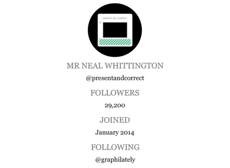
When graphic designer Mr Neal Whittington decided to open a stationery shop in 2008, few could have predicted that paperclips and envelopes could be such a draw. But Mr Whittington’s personal passion for the tools of his trade – combined with a talent for sourcing wonderful rare examples of vintage and modern from around the world, and arranging them in witty photoshoots – has changed the concept of office supplies for hundreds of thousands of now dedicated fans.
Currently living in London, with a bricks and mortar store off London’s Exmouth Market, Mr Whittington only joined Instagram last April, having previously amassed his loyal following largely through newsletters. As Present & Correct continues to grow, he says, “We hope to get a larger space and a larger audience.” Instagram will undoubtedly help spread that word while bringing a little right-angled, hole-punched, multi-coloured joy to all its followers.
Shoot from this tip: “As in life, be yourself. And edit, only put up the things you love.”
Follows: @graphilately “For amazing old stamps.”