THE JOURNAL

Photograph by Ms Fanny Latour Lambert
The smart way to wear the boldest colours this autumn and winter.
It’s universally acknowledged that us men, on the whole, aren’t huge fans of colour. All of us, at some point have been guilty of hiding behind a safety blanket of tried and tested navy, black and grey. Of course, there’s nothing wrong with these versatile shades – in fact, we’re pretty fond of them here at MR PORTER HQ – but sometimes, it’s worth branching out from our neutral and monochrome comfort zone, so to speak. Mr David Hockney, the celebrated artist and style icon once said “I prefer living in colour”, which as it turns out is more than just flippant artistic speak: numerous studies of leading universities have shown that bold colours can boost your mood, lower blood pressure and sharpen your concentration. While we can’t claim an electric blue sweater will prevent a coronary, there’s certainly evidence to suggest that bold-hued attire might just be the tonic you need to get through the gloom of Sad season. Luckily, for AW18, vivid shades were big on the runways of London, Paris, Milan and New York which our clever buyers picked up on. If you’re feeling a bit green about where to start with your jewel tones and pop shades, our succinct guide should help you broaden your palette.
The bold bomber

If you’re just testing the pantone waters with caution, experimenting with blue is a great starting point. Blue is known to have a calming effect and as reported in The New York Times, a 2009 experiment at the University of British Columbia found that the soothing shade actually enhances creativity – clearly there’s good reason it’s called “blue sky thinking”. From a sartorial standpoint, bright blues tend to partner well with earthy autumnal shades – also a key trend this season – which is why we’ve suggested teaming this cobalt blue Valstar suede bomber with this cloud-soft brown polo by Prada.

The eye-catching sweater
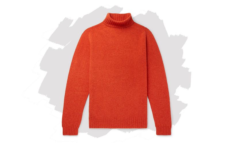
Along with red, orange has a warming effect and, according to the psychology of colours, both are shades we are instinctively drawn to. Don this MAN 1924 rollneck and you’ll definitely stand out in a sea of muted winter hues for all the right reasons. As it’s a pretty vivid shade, you’ll want to avoid pairing it with other bright hues, otherwise you may run the risk of looking like a highway repairman in hi-vis. These herringbone trousers are smart, but not overly starchy thanks to their forgiving pleats. Their grey hue will help temper that bold orange up top and, crucially, let it take centre stage.

The zesty cover up
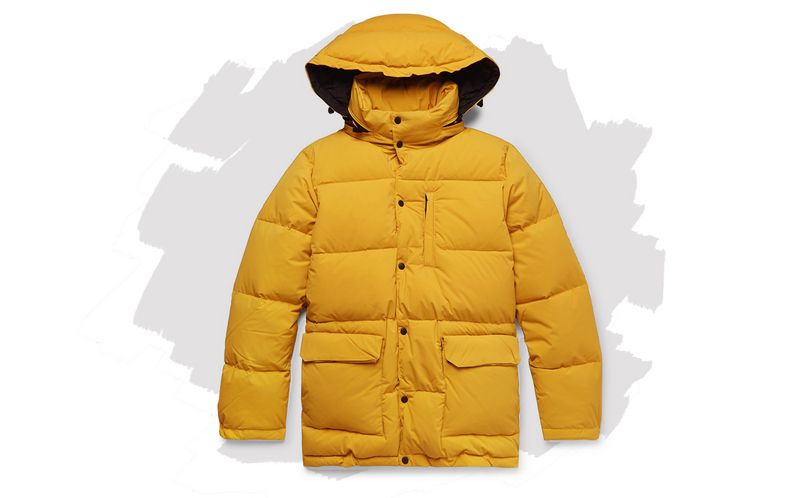
Think of yellow and you’re immediately transported to warmer climes… it is the colour of sunshine, after all. Even in 1917, we were aware of the cheering effect of the shade, when a British colourist by the name of Mr Howard Kemp painted the walls of a room in a London hospital lemon yellow to help soothe shell-shocked soldiers. While Sad is obviously far less debilitating than trench trauma, there is surely some benefit to be had by wearing this jolly yellow Aspesi down jacket. Again, you’ll want something to temper that sunny disposition with something a little more serious – black is the ideal choice for staying grounded. Pull on these sturdy Dunhill hiking boots and you’ll be all set to tackle the most foreboding of winter days.
