THE JOURNAL

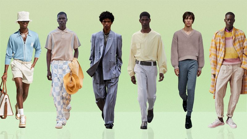
From left: AMIRI. Photograph by Mr Frank Terry, courtesy of AMIRI. Jacquemus. Photograph by IMAXtree. Ermenegildo Zegna. Photograph by IMAXtree. Ermenegildo Zegna. Photograph by IMAXtree. Prada. Photograph by IMAXtree. Isabel Marant. Photograph by IMAXtree
For all their nostalgia (Miami Vice, anyone?) and nursery associations, pastels – the sort you wear, not the sort you eat, of course – used to be much more intimidating than the darker side of the spectrum. Black, navy, grey – the innocuous sum total of our everyday wardrobes – can be rather bland in comparison. Think about it. Apart from, perhaps, noting the fit or cut of his jacket, no one, not even the most style-conscious among us, gives a man wearing a sharply tailored charcoal suit a second thought. But a candyfloss-pink two-piece, akin to what Mr Alessandro Michele put forward in Gucci’s SS21 Resort collection? Now we’re talking.
Truthfully, unless you’re Mr Harry Styles, it can be a challenge to pull off a head-to-toe sherbet look. And it’s not something we’d suggest you don on the trading floor. Although, come to think of it, back in the 1980s, pastels signalled “prep” and it was common to see soft pistachio or pink shirts with a pinstripe suit of the top half of the Waspy country club uniform.
All of which is to say that pastels can be complicated. Deployed correctly, they can be puerile, twee or elitist. They can also be incredibly stylish. If you’re new to them, you’re right to be a little wary. But if you didn’t throw caution to the wind once in a while, then you won’t be able to don a pair of lemon-yellow shorts from AMIRI’s latest collection. And that would be a crying shame. Plus, when you consider that the other big “colour story” of the season is pops of neon, the palest of shades don’t seem nearly as scary.
The imminent arrival of spring has naturally turned our attention to a softer palette. It’s no coincidence that pastels have appeared in the collections of top designers and brands this season. As soon as the days start to get longer and the sun gets higher in the sky, colour makes a welcome return to our wardrobes.
This time last year, the “p” word was all anyone could talk about. The showing has been altogether more sophisticated, and therefore less challenging, this time around. Take Ermenegildo Zegna, for example. Fresh from a partnership with Mr Jerry Lorenzo and his team at Fear of God, the Italian luxury label showed dusty sage suits and buttermilk-yellow silk shirts as well as a striped lavender double-breasted blazer complete with flowing, wide-legged trousers. Languid, louche and altogether unhurried, this is how the grown-ups do it.
Then there were the subtler takes. Mint-green canvas sneakers at Craig Green, some with the box standard laces switched out for pale-pink ones – a flash (or whisper?) of colour to foil otherwise monochrome looks. For further proof of just how wearable pastels can be in 2021, see the washed-out notes of coral, rose and cornflower blue at Isabel Marant and Jacquemus.
It’s not just the runways that are sporting a tonal redux. Champion, the, er, champion of streetwise loungewear, recently released a raft of sweats in delectable macaroon shades at MR PORTER. Sportswear giants Nike, adidas and New Balance, rejecting a precedent set in the 1980s for bright and fluoro sneakers, have all been dabbling in pale but interesting colourways.
If pastels were once a shy occurrence on the catwalks – noteworthy enough for fashion editors to highlight – the effect of this saturation is a growing sense that now, especially in smaller does, they’re beginning to become routine, as much of a given as floral prints or slides in summer. Is there a danger that this ubiquity could lead to tedium? perhaps. For now at least, we could get used to this.