THE JOURNAL
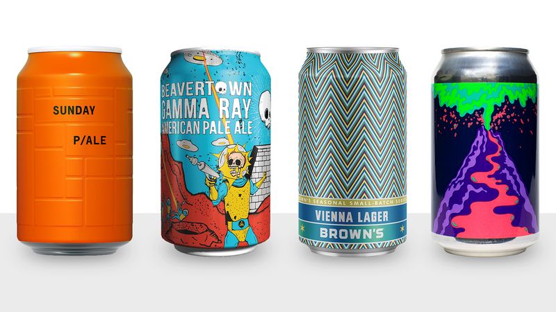
The five best examples of can art from around the world .
In this marvellous golden age of brewskis, we now have more sudsy options than ever. But with the boon comes a crippling drawback: while direct recommendations from friends, salespeople, or ratings websites are undeniably helpful, how is a thirsty drinker supposed to walk into a pub, supermarket, or off-licence and choose one IPA over another? Bewildered consumers often simply default to what they already know.
To stand out from the crowd, today’s breweries are going the extra mile with incredible bottle and can artwork. In the US, where there are about 6,000 breweries, brands such as Montauk Brewing Co. and House Beer owe much of their success to their suave labels. And as beer quality continues to improve, aesthetics is becoming more important in setting the phenomenal apart from the merely great.
So which breweries’ containers are most worthy of placement on your mantelpiece after you’ve drained them of their sweet nectar? We’ve rounded up the five best examples of label art from around the world, so that you can drink in style wherever you are.
US
Brown’s Brewing Co
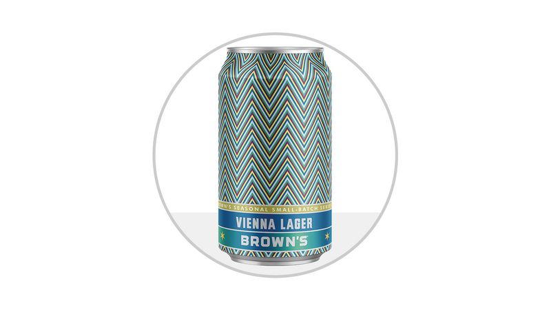
The US has led the past decade’s craft beer renaissance – and the country is just as much of a leader when it comes to packaging, too, with some of the most creative labels on the planet. Brown’s Brewing of Troy, New York, might have a plain name, but their cans could not possibly look cooler. More than two decades after founding the brewery, Garrett Brown’s company saw a more traditional makeover in 2014. But the brand has outdone itself with its 2017 facelift, using bold, colourful, geometric designs to convey to the world that the beers inside – like their sassy Cherry Razz or seasonal Vienna Lager – are jam-packed with flavour.
SWEDEN
Omnipollo
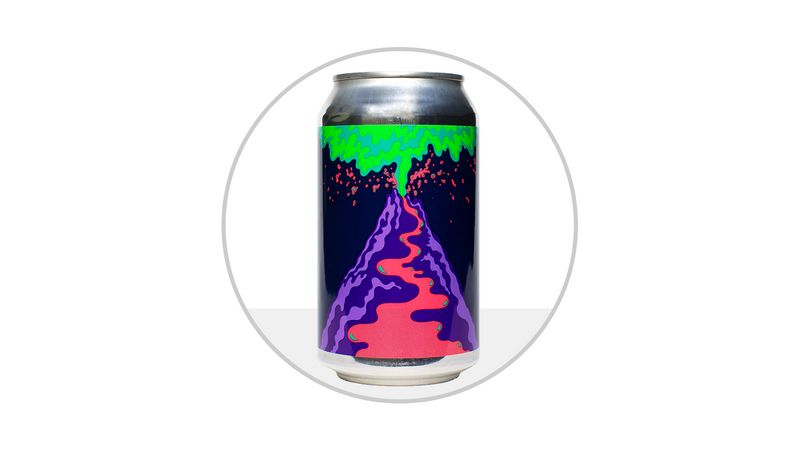
Omnipollo brewer Mr Henok Fentie and artist Mr Karl Grandin have been cranking out one-of-a-kind (often culinary-inspired) beers in tandem with stunning modern artwork since 2011. The brewery’s first canned beer – a mango s’mores IPA brewed with vanilla, marshmallow fluff, and graham crackers called Shploing!! – features a shockingly neon volcano erupting as explosively as the beer’s flavours. Their beers aren’t the easiest to find outside their native Scandinavia – but if you’re able to track one down, resist the urge to save the bottle as a mere work of art, and crack it open to enjoy the liquid gold inside.
UK
Beavertown Brewery
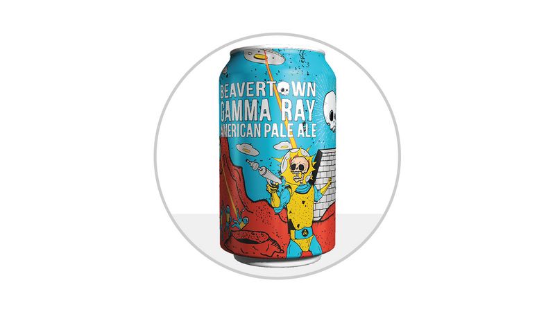
The illustrations on Beavertown Brewery products look like they were torn directly from apocalyptic sci-fi comic books. The creepy – yet alluring – original drawings penned by the brewery’s creative director and moonlighting artist Mr Nick Dwyer perfectly reflect the off-kilter vibe the brewery presents with tasty ales such as Neck Oil Session IPA, or Smog Rocket smoked porter. Their flagship Gamma Ray American Pale Ale (APA), for example, features a gaggle of flying saucers firing death rays at spacemen, igniting their heads and melting their flesh to the bone. Fortunately, the beer is safer to drink than its label would imply.
GERMANY
And Union
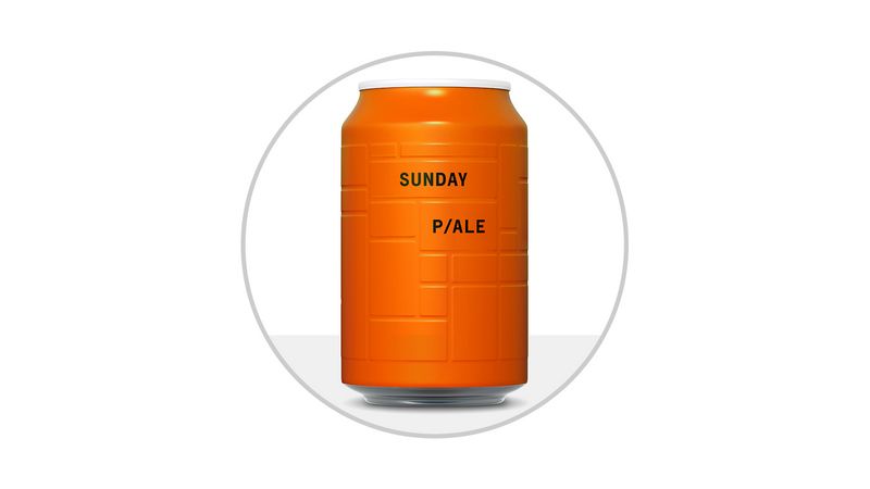
Minimalists, in particular, will appreciate And Union’s simple – but incredibly recognisable – designs. Founded in 2007, the German brand markets beer from four small, family-owned Bavarian breweries (from 90 to 500 years old!) under their own “modernist” brand – the basic principles of which are “rationality and simplicity.” These tenets are most definitely reflected in their beer labels: their single-coloured cans feature nothing more than engraved intersecting lines and two or three words describing the beer; their bottles are similarly terse, with remarkably limited colour palettes. And the beers – like their packages – are correspondingly stripped down as slightly modernised versions (eg. an American hop here; some British influence there) of traditional German styles.
AUSTRALIA
Kaiju! Beer
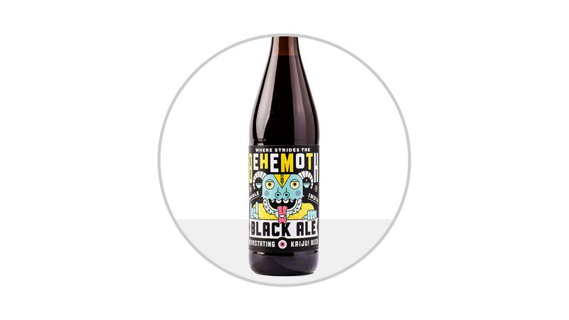
Japanese for “strange creature,” Kaiju! Beer labels couldn’t be more on the nose. The Australian brewery’s bottles are adorned with bright, colourful labels that each feature a unique and beautiful cartoon monster, hand drawn by Brooklyn illustrator Mr Mikey Burton. Even better, each illustration comes with a handful of so-called “Easter eggs” that directly relate to the beer and its name. Case in point: the label for Where Strides The Behemoth – a 10.8 per cent ABV double India black ale that very well might be the country’s biggest, baddest, hoppiest brew – features a horned beast, a pentagram, mini skulls, the sign of the Devil, and way more, all in one cute little package.